From my Second A-to-Z: Z-score


When I first published this I mentioned not knowing why ‘z’ got picked as a variable name. Any letter besides ‘x’ would make sense. As happens when I toss this sort of question out, I haven’t learned anything about why ‘z’ and not, oh, ‘y’ or ‘t’ or even ‘d’. My best guess is that we don’t want to confuse references to the original data with references to the transformed. And while you can write a ‘z’ so badly it looks like an ‘x’, it’s much easier to write a ‘y’ that looks like an ‘x’. I don’t know whether the Preliminary SAT is still a thing.


And we come to the last of the Leap Day 2016 Mathematics A To Z series! Z is a richer letter than x or y, but it’s still not so rich as you might expect. This is why I’m using a term that everybody figured I’d use the last time around, when I went with z-transforms instead.

Z-Score

You get an exam back. You get an 83. Did you do well?

Hard to say. It depends on so much. If you expected to barely pass and maybe get as high as a 70, then you’ve done well. If you took the Preliminary SAT, with a composite score that ranges from 60 to 240, an 83 is catastrophic. If the instructor gave an easy test, you maybe scored right in the middle of the pack. If the instructor sees tests as a way to weed out the undeserving, you maybe had the best score in the class. It’s impossible to say whether you did well without context.

The z-score is a way to provide that context. It draws that context by comparing a single score to all the other values. And underlying that comparison is the assumption that whatever it is we’re measuring fits a pattern. Usually it does. The pattern we suppose stuff we measure will fit is the Normal Distribution. Sometimes it’s called the Standard Distribution. Sometimes it’s called the Standard Normal Distribution, so that you know we mean business. Sometimes it’s called the Gaussian Distribution. I wouldn’t rule out someone writing the Gaussian Normal Distribution. It’s also called the bell curve distribution. As the names suggest by throwing around “normal” and “standard” so much, it shows up everywhere.

A normal distribution means that whatever it is we’re measuring follows some rules. One is that there’s a well-defined arithmetic mean of all the possible results. And that arithmetic mean is the most common value to turn up. That’s called the mode. Also, this arithmetic mean, and mode, is also the median value. There’s as many data points less than it as there are greater than it. Most of the data values are pretty close to the mean/mode/median value. There’s some more as you get farther from this mean. But the number of data values far away from it are pretty tiny. You can, in principle, get a value that’s way far away from the mean, but it’s unlikely.

We call this standard because it might as well be. Measure anything that varies at all. Draw a chart with the horizontal axis all the values you could measure. The vertical axis is how many times each of those values comes up. It’ll be a standard distribution uncannily often. The standard distribution appears when the thing we measure satisfies some quite common conditions. Almost everything satisfies them, or nearly satisfies them. So we see bell curves so often when we plot how frequently data points come up. It’s easy to forget that not everything is a bell curve.

The normal distribution has a mean, and median, and mode, of 0. It’s tidy that way. And it has a standard deviation of exactly 1. The standard deviation is a way of measuring how spread out the bell curve is. About 95 percent of all observed results are less than two standard deviations away from the mean. About 99 percent of all observed results are less than three standard deviations away. 99.9997 percent of all observed results are less than six standard deviations away. That last might sound familiar to those who’ve worked in manufacturing. At least it des once you know that the Greek letter sigma is the common shorthand for a standard deviation. “Six Sigma” is a quality-control approach. It’s meant to make sure one understands all the factors that influence a product and controls them. This is so the product falls outside the design specifications only 0.0003 percent of the time.

This is the normal distribution. It has a standard deviation of 1 and a mean of 0, by definition. And then people using statistics go and muddle the definition. It is always so, with the stuff people actually use. Forgive them. It doesn’t really change the shape of the curve if we scale it, so that the standard deviation is, say, two, or ten, or π, or any positive number. It just changes where the tick marks are on the x-axis of our plot. And it doesn’t really change the shape of the curve if we translate it, adding (or subtracting) some number to it. That makes the mean, oh, 80. Or -15. Or eπ. Or some other number. That just changes what value we write underneath the tick marks on the plot’s x-axis. We can find a scaling and translation of the normal distribution that fits whatever data we’re observing.

When we find the z-score for a particular data point we’re undoing this translation and scaling. We figure out what number on the standard distribution maps onto the original data set’s value. About two-thirds of all data points are going to have z-scores between -1 and 1. About nineteen out of twenty will have z-scores between -2 and 2. About 99 out of 100 will have z-scores between -3 and 3. If we don’t see this, and we have a lot of data points, then that’s suggests our data isn’t normally distributed.

I don’t know why the letter ‘z’ is used for this instead of, say, ‘y’ or ‘w’ or something else. ‘x’ is out, I imagine, because we use that for the original data. And ‘y’ is a natural pick for a second measured variable. z’, I expect, is just far enough from ‘x’ it isn’t needed for some more urgent duty, while being close enough to ‘x’ to suggest it’s some measured thing.

The z-score gives us a way to compare how interesting or unusual scores are. If the exam on which we got an 83 has a mean of, say, 74, and a standard deviation of 5, then we can say this 83 is a pretty solid score. If it has a mean of 78 and a standard deviation of 10, then the score is better-than-average but not exceptional. If the exam has a mean of 70 and a standard deviation of 4, then the score is fantastic. We get to meaningfully compare scores from the measurements of different things. And so it’s one of the tools with which statisticians build their work.

My All 2020 Mathematics A to Z: Statistics


I owe Mr Wu, author of the Singapore Maths Tuition blog, thanks for another topic for this A-to-Z. Statistics is a big field of mathematics, and so I won’t try to give you a course’s worth in 1500 words. But I have to start with a question. I seem to have ended at two thousand words.

Color cartoon illustration of a coati in a beret and neckerchief, holding up a director's megaphone and looking over the Hollywood hills. The megaphone has the symbols + x (division obelus) and = on it. The Hollywood sign is, instead, the letters MATHEMATICS. In the background are spotlights, with several of them crossing so as to make the letters A and Z; one leg of the spotlights has 'TO' in it, so the art reads out, subtly, 'Mathematics A to Z'.
Art by Thomas K Dye, creator of the web comics Projection Edge, Newshounds, Infinity Refugees, and Something Happens. He’s on Twitter as @projectionedge. You can get to read Projection Edge six months early by subscribing to his Patreon.

Statistics.

Is statistics mathematics?

The answer seems obvious at first. Look at a statistics textbook. It’s full of algebra. And graphs of great sloped mounds. There’s tables full of four-digit numbers in back. The first couple chapters are about probability. They’re full of questions about rolling dice and dealing cards and guessing whether the sibling who just entered is the younger.

But then, why does Rutgers University have a Department of Mathematics and also a Department of Statistics? And considered so distinct as to have an interdisciplinary mathematics-and-statistics track? It’s not an idiosyncrasy of Rutgers. Many schools have the same division between mathematics and statistics. Some join them into a Department of Mathematics and Statistics. But the name hints at something just different about the field. Not too different, though. Physics and Chemistry and important threads of Economics and History are full of mathematics. But you never see a Department of Mathematics and History.

Thinking of the field’s history, though, and its use, tell us more. Some of the earliest work we now recognize as statistics was Arab mathematicians deciphering messages. This cryptanalysis is the observation that (in English) a three-letter word is very likely to be ‘the’, mildly likely to be ‘one’, and not likely to be ‘pyx’. A more modern forerunner is the Republic of Venice supposedly calculating that war with Milan would not be worth the winning. Or the gatherings of mortality tables, recording how many people of what age can be expected to die any year, and what from. (Mortality tables are another of Edmond Halley’s claims to fame, though it won’t displace his comet work.) Florence Nightingale’s charts explaining how more soldiers die of disease than in fighting the Crimean War. William Sealy Gosset sharing sample-testing methods developed at the Guinness brewery.

You see a difference in kind to a mathematical question like finding a square with the same area as this trapezoid. It’s not that mathematics is not practical; it’s always been. And it’s not that statistics lacks abstraction and pure mathematics content. But statistics wears practicality in a way that number theory won’t.

Practical about what? History and etymology tip us off. The early uses of things we now see as statistics are about things of interest to the State. Decoding messages. Counting the population. Following — in the study of annuities — the flow of money between peoples. With the industrial revolution, statistics sneaks into the factory. To have an economy of scale you need a reliable product. How do you know whether the product is reliable, without testing every piece? How can you test every beer brewed without drinking it all?

One great leg of statistics — it’s tempting to call it the first leg, but the history is not so neat as to make that work — is descriptive. This gives us things like mean and median and mode and standard deviation and quartiles and quintiles. These try to let us represent more data than we can really understand in a few words. We lose information in doing so. But if we are careful to remember the difference between the descriptive statistics we have and the original population? (nb, a word of the State) We might not do ourselves much harm.

Another great leg is inferential statistics. This uses tools with names like z-score and the Student t distribution. And talk about things like p-values and confidence intervals. Terms like correlation and regression and such. This is about looking for causes in complex scenarios. We want to believe there is a cause to, say, a person’s lung cancer. But there is no tracking down what that is; there are too many things that could start a cancer, and too many of them will go unobserved. But we can notice that people who smoke have lung cancer more often than those who don’t. We can’t say why a person recovered from the influenza in five days. But we can say people who were vaccinated got fewer influenzas, and ones that passed quicker, than those who did not. We can get the dire warning that “correlation is not causation”, uttered by people who don’t like what the correlation suggests may be a cause.

Also by people being honest, though. In the 1980s geologists wondered if the sun might have a not-yet-noticed companion star. Its orbit would explain an apparent periodicity in meteor bombardments of the Earth. But completely random bombardments would produce apparent periodicity sometimes. It’s much the same way trees in a forest will sometimes seem to line up. Or imagine finding there is a neighborhood in your city with a high number of arrests. Is this because it has the highest rate of street crime? Or is the rate of street crime the same as any other spot and there are simply more cops here? But then why are there more cops to be found here? Perhaps they’re attracted by the neighborhood’s reputation for high crime. It is difficult to see through randomness, to untangle complex causes, and to root out biases.

The tools of statistics, as we recognize them, largely came together in the 19th and early 20th century. Adolphe Quetelet, a Flemish scientist, set out much early work, including introducing the concept of the “average man”. He studied the crime statistics of Paris for five years and noticed how regular the numbers were. The implication, to Quetelet — who introduced the idea of the “average man”, representative of societal matters — was that crime is a societal problem. It’s something we can control by mindfully organizing society, without infringing anyone’s autonomy. Put like that, the study of statistics seems an obvious and indisputable good, a way for governments to better serve their public.

So here is the dispute. It’s something mathematicians understate when sharing the stories of important pioneers like Francis Galton or Karl Pearson. They were eugenicists. Part of what drove their interest in studying human populations was to find out which populations were the best. And how to help them overcome their more-populous lessers.

I don’t have the space, or depth of knowledge, to fully recount the 19th century’s racial politics, popular scientific understanding, and international relations. Please accept this as a loose cartoon of the situation. Do not forget the full story is more complex and more ambiguous than I write.

One of the 19th century’s greatest scientific discoveries was evolution. That populations change in time, in size and in characteristics, even budding off new species, is breathtaking. Another of the great discoveries was entropy. This incorporated into science the nostalgic romantic notion that things used to be better. I write that figuratively, but to express the way the notion is felt.

There are implications. If the Sun itself will someday wear out, how long can the Tories last? It was easy for the aristocracy to feel that everything was quite excellent as it was now and dread the inevitable change. This is true for the aristocracy of any country, although the United Kingdom had a special position here. The United Kingdom enjoyed a privileged position among the Great Powers and the Imperial Powers through the 19th century. Note we still call it the Victorian era, when Louis Napoleon or Giuseppe Garibaldi or Otto von Bismarck are more significant European figures. (Granting Victoria had the longer presence on the world stage; “the 19th century” had a longer presence still.) But it could rarely feel secure, always aware that France or Germany or Russia was ready to displace it.

And even internally: if Darwin was right and reproductive success all that matters in the long run, what does it say that so many poor people breed so much? How long could the world hold good things? Would the eternal famines and poverty of the “overpopulated” Irish or Indian colonial populations become all that was left? During the Crimean War, the British military found a shocking number of recruits from the cities were physically unfit for service. In the 1850s this was only an inconvenience; there were plenty of strong young farm workers to recruit. But the British population was already majority-urban, and becoming more so. What would happen by 1880? 1910?

One can follow the reasoning, even if we freeze at the racist conclusions. And we have the advantage of a century-plus hindsight. We can see how the eugenic attitude leads quickly to horrors. And also that it turns out “overpopulated” Ireland and India stopped having famines once they evicted their colonizers.

Does this origin of statistics matter? The utility of a hammer does not depend on the moral standing of its maker. The Central Limit Theorem has an even stronger pretense to objectivity. Why not build as best we can with the crooked timbers of mathematics?

It is in my lifetime that a popular racist book claimed science proved that Black people were intellectual inferiors to White people. This on the basis of supposedly significant differences in the populations’ IQ scores. It proposed that racism wasn’t a thing, or at least nothing to do anything about. It would be mere “realism”. Intelligence Quotients, incidentally, are another idea we can trace to Francis Galton. But an IQ test is not objective. The best we can say is it might be standardized. This says nothing about the biases built into the test, though, or of the people evaluating the results.

So what if some publisher 25 years ago got suckered into publishing a bad book? And racist chumps bought it because they liked its conclusion?

The past is never fully past. In the modern environment of surveillance capitalism we have abundant data on any person. We have abundant computing power. We can find many correlations. This gives people wild ideas for “artificial intelligence”. Something to make predictions. Who will lose a job soon? Who will get sick, and from what? Who will commit a crime? Who will fail their A-levels? At least, who is most likely to?

These seem like answerable questions. One can imagine an algorithm that would answer them fairly. And make for a better world, one which concentrates support around the people most likely to need it. If we were wise, we would ask our friends in the philosophy department about how to do this. Or we might just plunge ahead and trust that since an algorithm runs automatically it must be fair. Our friends in the philosophy department might have some advice there too.

Consider, for example, the body mass index. It was developed by our friend Adolphe Quetelet, as he tried to understand the kinds of bodies in the population. It is now used to judge whether someone is overweight. Weight is treated as though it were a greater threat to health than actual illnesses are. Your diagnosis for the same condition with the same symptoms will be different — and on average worse — if your number says 25.2 rather than 24.8.

We must do better. We can hope that learning how tools were used to injure people will teach us to use them better, to reduce or to avoid harm. We must fight our tendency to latch on to simple ideas as the things we can understand in the world. We must not mistake the greater understanding we have from the statistics for complete understanding. To do this we must have empathy, and we must have humility, and we must understand what we have done badly in the past. We must catch ourselves when we repeat the patterns that brought us to past evils. We must do more than only calculate.


This and the rest of the 2020 A-to-Z essays should be at this link. All the essays from every A-to-Z series should be gathered at this link. And I am looking for V, W, and X topics to write about. Thanks for your thoughts, and thank you for reading.

My 2019 Mathematics A To Z: Chi-squared test


Today’s A To Z term is another from Mr Wu, of mathtuition88.com. The term does not, technically, start with X. But the Greek letter χ certainly looks like an X. And the modern English letter X traces back to that χ. So that’s near enough for my needs.

Cartoony banner illustration of a coati, a raccoon-like animal, flying a kite in the clear autumn sky. A skywriting plane has written 'MATHEMATIC A TO Z'; the kite, with the letter 'S' on it to make the word 'MATHEMATICS'.
Art by Thomas K Dye, creator of the web comics Projection Edge, Newshounds, Infinity Refugees, and Something Happens. He’s on Twitter as @projectionedge. You can get to read Projection Edge six months early by subscribing to his Patreon.

χ2 Test.

The χ2 test is a creature of statistics. Creatures, really. But if one just says “the χ2 test” without qualification they mean Pearson’s χ2 test. Pearson here is a familiar name to anyone reading the biographical sidebar in their statistics book. He was Karl Pearson, who in the late 19th and early 20th century developed pretty much every tool of inferential statistics.

Pearson was, besides a ferocious mathematical talent, a white supremacist and eugenicist. This is something to say about many pioneers of statistics. Many of the important basics of statistics were created to prove that some groups of humans were inferior to the kinds of people who get offered an OBE. They were created at a time that white society was very afraid that it might be out-bred by Italians or something even worse. This is not to say the tools of statistics are wrong, or bad. It is to say that anyone telling you mathematics is a socially independent, politically neutral thing is a fool or a liar.

Inferential statistics is the branch of statistics used to test hypotheses. The hypothesis, generally, is about whether one sample of things is really distinguishable from a population of things. It is different from descriptive statistics, which is that thing I do each month when I say how many pages got a view and from how many countries. Descriptive statistics give us a handful of numbers with which to approximate a complicated things. Both do valuable work, although I agree it seems like descriptive statistics are the boring part. Without them, though, inferential statistics has nothing to study.

The χ2 test works like many hypothesis-testing tools do. It takes two parts. One of this is observations. We start with something that comes in two or more categories. Categories come in many kinds: the postal code where a person comes from. The color of a car. The number of years of schooling someone has had. The species of flower. What is important is that the categories be mutually exclusive. One has either been a smoker for more than one year or else one has not.

Count the number of observations of … whatever is interesting … for each category. There is some fraction of observations that belong to the first category, some fraction that belong to the second, some to the third, and so on. Find those fractions. This is all easy enough stuff, really. Counting and dividing by the total number of observations. Which is a hallmark of many inferential statistics tools. They are often tedious, involving a lot of calculation. But they rarely involve difficult calculations. Square roots are often where they top out.

That covers observations. What we also need are expectations. This is our hypothesis for what fraction “ought” to be in each category. How do you know what there “ought” to be? … This is the hard part of inferential statistics. Often we are interested in showing that some class is more likely than another to have whatever we’ve observed happen. So we can use as a hypothesis that the thing is observed just as much in one case as another. If we want to test whether one sample is indistinguishable from another, we use the proportions from the other sample. If we want to test whether one sample matches a theoretical ideal, we use that theoretical ideal. People writing probability and statistics problems love throwing dice. Let me make that my example. We hypothesize that on throwing a six-sided die a thousand times, each number comes up exactly one-sixth of the time.

It’s impossible that each number will come up exactly one-sixth of the time, in a thousand throws. We could only hope to achieve this if we tossed some ridiculous number like a thousand and two times. But even if we went to that much extra work, it’s impossible that each number would come up exactly the 167 times. Here I mean it’s “impossible” in the same way it’s impossible I could drop eight coins from my pocket and have them all come up tails. Undoubtedly, some number will be unlucky and just not turn up the full 167 times. Some other number will come up a bit too much. But it’s not required; it’s just like that. Some coin lands heads.

This doesn’t necessarily mean the die is biased. The question is whether the observations are too far off from the prediction. How far is that? For each category, take the difference between the observed frequency and the expected frequency. Square that. Divide it by the expected frequency. Once you’ve done that for every category, add up all these numbers. This is χ2. Do all this and you’ll get some nice nonnegative number like, oh, 5.094 or 11.216 or, heck, 20.482.

The χ2 test works like many inferential-statistics tests do. It tells us how likely it is that, if the hypothetical expected values were right, that random chance would give us the observed data. The farther χ2 is from zero, the less likely it is this was pure chance. Which, all right. But how big does it have to be?

It depends on two important things. First is the number of categories that you have. Or, to use the lingo, the degrees of freedom in your problem. This is one minus the total number of categories. The greater the number of degrees of freedom, the bigger χ2 can be without it saying this difference can’t just be chance.

The second important thing is called the alpha level. This is a judgement call. This is how unlikely you want a result to be before you’ll declare that it couldn’t be chance. We have an instinctive idea of this. If you toss a coin twenty times and it comes up tails every time, you’ll declare that was impossible and the coin must be rigged. But it isn’t impossible. Start a run of twenty coin flips right now. You have a 0.000 095 37% chance of it being all tails. But I would be comfortable, on the 20th tail, to say something is up. I accept that I am ascribing to malice what is in fact just one of those things.

So the choice of alpha level is a measure of how willing we are to make a mistake in our conclusions. In a simple science like particle physics we can set very stringent standards. There are many particles around and we can smash them as long as the budget holds out. In more difficult sciences, such as epidemiology, we must let alpha be larger. We often accept an alpha of five-percent or one-percent.

What we must do, then, is find for an alpha level and a number of degrees of freedom, what the threshold χ2 is. If the sample’s χ2 is below that threshold, OK. The observations are consistent with the hypothesis. If the sample’s χ2 is larger than that threshold, OK. It’s less-than-the-alpha-level percent likely that the observations are consistent with the hypothesis. This is what most statistical inference tests are like. You calculate a number and check whether it is above or below a threshold. If it’s below the threshold, the observation is consistent with the hypothesis. If it’s above the threshold, there’s less than the alpha-level chance that the observation is consistent with the hypothesis.

How do we find these threshold values? … Well, under no circumstances do we try to calculate those. They’re based on a thing called the χ2 distributions, the name you’d expect. They’re hard to calculate. There is no earthly reason for you to calculate them. You can find them in the back of your statistics textbook. Or do a web search for χ2 test tables. I’m sure Matlab has a function to give you this. If it doesn’t, there’s a function you can download from somebody to work it out. There’s no need to calculate that yourself. Which is again common to inferential statistics tests. You find the thresholds by just looking them up.

χ2 tests are just one of the hypothesis-testing tools of inferential statistics. They are a good example of such. They’re designed for observations that can be fit into several categories, and comparing those to an expected forecast. But the calculations one does, and the way one interprets them, are typical for these tests. Even the way they are more tedious than hard is typical. It’s a good example of the family of tools.


I have two letters, and one more week, to go in this series. I hope to have the letter Y published on Tuesday. All the other A-to-Z essays for this year are also at that link. Past A-to-Z essays are at this link, and for the end of this week I’ll feature two past essays at this link. Thank you for reading all this.

Advertising and Linear Regression


I wanted to share an article that’s been making the rounds of my online circles. It’s Jesse Frederik and Maruits Martijn’s The new dot com bubble is here: it’s called online advertising. The point of the article is exploring whether online advertising even works, and how we know whether it does.

The article goes into several wys that one can test whether a thing has an effect. These naturally get mathematical. Among the tests developed is one that someone who didn’t know mathematics might independently invent. This is called linear regression, or linear correlation. The idea is to run experiments. If you think something causes an effect, try doing a little of that something. Measure how big the effect is. Then try doing more of that something. How big is the effect now? Try a lot. How big is the effect? Do none of it. How big is the effect?

Through calculations that are tedious but not actually hard, you can find a line that “best fits” the data. And it will tell you whether, on average, increasing the something will increase the effect. Or decrease it. There are subsidiary tests that will tell you how strong the fit is. That is, whether the something and the effect match their variations very well, or whether there’s just a loose correspondence. It can easily be that random factors, or factors you aren’t looking at, are more important than the something you’re trying to vary, after all.

In principle, online advertising should be excellent at matching advertising to people. It’s quite easy to test different combinations of sales pitches and measure how much of whatever it is gets bought. In practice?

You have surely heard the aphorism that correlation does not prove causation, usually from someone trying to explain that we can’t really prove that some large industry is doing something murderous and awful. But there are also people who will say this in honest good faith. Showing that, say, placing advertisements in one source correlates with a healthy number of sales does not prove that the advertisements helped any. One needs to design experiments thoughtfully to tease that out. Part of Frederik and Martijn’s essay is about the search for those thoughtful experiments, and what they indicate. There is an old saw that in science what one does not measure one does not understand. But it is also true that measuring a thing does not mean one understands it.

(Linear regression is far from the only tool available, or discussed in the article. It’s one that’s easy to imagine and explain, both in goal and in calculation, however.)

Reading the Comics, March 19, 2019: Average Edition


This time around, averages seem important.

Mark Anderson’s Andertoons for the 18th is the Mark Anderson’s Andertoons for the week. This features the kids learning some of the commonest terms in descriptive statistics. And, as Wavehead says, the similarity of names doesn’t help sorting them out. Each is a kind of average. “Mean” usually is the arithmetic mean, or the thing everyone including statisticians calls “average”. “Median” is the middle-most value, the one that half the data is less than and half the data is greater than. “Mode” is the most common value. In “normally distributed” data, these three quantities are all the same. In data gathered from real-world measurements, these are typically pretty close to one another. It’s very easy for real-world quantities to be normally distributed. The exceptions are usually when there are some weird disparities, like a cluster of abnormally high-valued (or low-valued) results. Or if there are very few data points.

On the blackboard the teacher's written Median, Mode, and Mean, with a bunch of numbers from 3 through 15. Wavehead: 'I know they're all subtly different, but I have to say, the alliteration doesn't help.'
Mark Anderson’s Andertoons for the 18th of March, 2019. Essays which discuss topics raised by Andertoons can be found at this link. Also at this link, nearly enough.

The word “mean” derives from the Old French “meien”, that is, “middle, means”. And that itself traces to the Late Latin “medianus”, and the Latin “medius”. That traces back to the Proto-Indo-European “medhyo”, meaning “middle”. That’s probably what you might expect, especially considering that the mean of a set of data is, if the data is not doing anything weird, likely close to the middle of the set. The term appeared in English in the middle 15th century.

The word “median”, meanwhile, follows a completely different path. That one traces to the Middle French “médian”, which traces to the Late Latin “medianus” and Latin “medius” and Proto-Indo-European “medhyo”. This appeared as a mathematical term in the late 19th century; Etymology Online claims 1883, but doesn’t give a manuscript citation.

The word “mode”, meanwhile, follows a completely different path. This one traces to the Old French “mode”, itself from the Latin “modus”, meaning the measure or melody or style. We get from music to common values by way of the “style” meaning. Think of something being done “á la mode”, that is, “in the [ fashionable or popular ] style”. I haven’t dug up a citation about when this word entered the mathematical parlance.

So “mean” and “median” don’t have much chance to do anything but alliterate. “Mode” is coincidence here. I agree, it might be nice if we spread out the words a little more.

Edison, pointing to a checkerboard: 'So Grandpa if you put one cookie on the first square, two on the second, four on the next, then eight, and you keep doubling them until you fill all 64 squares do you know what you'll end up with?' Grandpa: 'A stomachache for a month?'
John Hambrock’s The Brilliant Mind of Edison Lee for the 18th of March, 2019. I’ve been talking about this strip a lot lately, it seems to me. Essays where I do discuss Edison Lee are at this link.

John Hambrock’s The Brilliant Mind of Edison Lee for the 18th has Edison introduce a sequence to his grandfather. Doubling the number of things for each square of a checkerboard is an ancient thought experiment. The notion, with grains of wheat rather than cookies, seems to be first recorded in 1256 in a book by the scholar Ibn Khallikan. One story has it that the inventor of chess requested from the ruler that many grains of wheat as reward for inventing the game.

If we followed Edison Lee’s doubling through all 64 squares we’d have, in total, need for 263-1 or 18,446,744,073,709,551,615 cookies. You can see why the inventor of chess didn’t get that reward, however popular the game was. It stands as a good display of how exponential growth eventually gets to be just that intimidatingly big.

Edison, like many a young nerd, is trying to stagger his grandfather with the enormity of this. I don’t know that it would work. Grandpa ponders eating all that many cookies, since he’s a comical glutton. I’d estimate eating all that many cookies, at the rate of one a second, eight hours a day, to take something like eighteen billion centuries. If I’m wrong? It doesn’t matter. It’s a while. But is that any more staggering than imagining a task that takes a mere ten thousand centuries to finish?

Toby, looking at his homework, and a calculator, and a textbook: '... Wow. Crazy ... Huh. How about that? ... Am I stupid if math *always* has a surprise ending?'
Greg Cravens’s The Buckets for the 19th of March, 2019. It also seems like I discuss The Buckets more these days, as seen at this link.

Greg Cravens’s The Buckets for the 19th sees Toby surprised by his mathematics homework. He’s surprised by how it turned out. I know the feeling. Everyone who does mathematics enough finds that. Surprise is one of the delights of mathematics. I had a great surprise last month, with a triangle theorem. Thomas Hobbes, the philosopher/theologian, entered his frustrating sideline of mathematics when he found the Pythagorean Theorem surprising.

Mathematics is, to an extent, about finding interesting true statements. What makes something interesting? That depends on the person surprised, certainly. A good guideline is probably “something not obvious before you’ve heard it, thatlooks inevitable after you have”. That is, a surprise. Learning mathematics probably has to be steadily surprising, and that’s good, because this kind of surprise is fun.

If it’s always a surprise there might be trouble. If you’re doing similar kinds of problems you should start to see them as pretty similar, and have a fair idea what the answers should be. So, from what Toby has said so far … I wouldn’t call him stupid. At most, just inexperienced.

Caption: Eric had good feelings about his date. It turned out, contrary to what he first thought ... [ Venn Diagram picture of two circles with a good amount of overlap ] ... They actually had quite a lot in common.
Eric the Circle for the 19th of March, 2019, this one by Janka. This and other essays with Eric the Circle, by any artist, should be at this link.

Eric the Circle for the 19th, by Janka, is the Venn Diagram joke for the week. Properly any Venn Diagram with two properties has an overlap like this. We’re supposed to place items in both circles, and in the intersection, to reflect how much overlap there is. Using the sizes of each circle to reflect the sizes of both sets, and the size of the overlap to represent the size of the intersection, is probably inevitable. The shorthand calls on our geometric intuition to convey information, anyway.

She: 'What time is it?' He: 'The clock in the hall says 7:56, the oven clock says 8:02, the DVD clock says 8:07, and the bed table clock says 8:13.' She: 'Which one's right?' He: 'I dunno.' She: 'Let's ee. Four clocks ... carry the one ... divided by four ... ' He: 'Whenever we want to know what time it is we have to do algebra.' She: 'We better hurry, it's 8:05 and five-eighths!'
Tony Murphy’s It’s All About You for the 19th of March, 2019. And the occasional time I discuss something from It’s All About You are here.

Tony Murphy’s It’s All About You for the 19th has a bunch of things going on. The punch line calls “algebra” what’s really a statistics problem, calculating the arithmetic mean of four results. The work done is basic arithmetic. But making work seem like a more onerous task is a good bit of comic exaggeration, and algebra connotes something harder than arithmetic. But Murphy exaggerates with restraint: the characters don’t rate this as calculus.

Then there’s what they’re doing at all. Given four clocks, what’s the correct time? The couple tries averaging them. Why should anyone expect that to work?

There’s reason to suppose this might work. We can suppose all the clocks are close to the correct time. If they weren’t, they would get re-set, or not looked at anymore. A clock is probably more likely to be a little wrong than a lot wrong. You’d let a clock that was two minutes off go about its business, in a way you wouldn’t let a clock that was three hours and 42 minutes off. A clock is probably as likely to show a time two minutes too early as it is two minutes too late. This all suggests that the clock errors are normally distributed, or something like that. So the error of the arithmetic mean of a bunch of clock measurements we can expect to be zero. Or close to zero, anyway.

There’s reasons this might not work. For example, a clock might systematically run late. My mantle clock, for example, usually drifts about a minute slow over the course of the week it takes to wind. Or the clock might be deliberately set wrong: it’s not unusual to set an alarm clock to five or ten or fifteen minutes ahead of the true time, to encourage people to think it’s later than it really is and they should hurry up. Similarly with watches, if their times aren’t set by Internet-connected device. I don’t know whether it’s possible to set a smart watch to be deliberately five minutes fast, or something like that. I’d imagine it should be possible, but also that the people programming watches don’t see why someone might want to set their clock to the wrong time. From January to March 2018, famously, an electrical grid conflict caused certain European clocks to lose around six minutes. The reasons for this are complicated and technical, and anyway The Doctor sorted it out. But that sort of systematic problem, causing all the clocks to be wrong in the same way, will foil this take-the-average scheme.

Murphy’s not thinking of that, not least because this comic’s a rerun from 2009. He was making a joke, going for the funnier-sounding “it’s 8:03 and five-eights” instead of the time implied by the average, 8:04 and a half. That’s all right. It’s a comic strip. Being amusing is what counts.


There were just enough mathematically-themed comic strips this past week for one more post. When that is ready, it should be at this link. I’ll likely post it Tuesday.

My 2018 Mathematics A To Z: Box-And-Whisker Plot


Today’s A To Z term is another from Iva Sallay, Find The Factors blog creator and, as with asymptote, friend of the blog. Thank you for it.

Cartoon of a thinking coati (it's a raccoon-like animal from Latin America); beside him are spelled out on Scrabble titles, 'MATHEMATICS A TO Z', on a starry background. Various arithmetic symbols are constellations in the background.
Art by Thomas K Dye, creator of the web comics Newshounds, Something Happens, and Infinity Refugees. His current project is Projection Edge. And you can get Projection Edge six months ahead of public publication by subscribing to his Patreon. And he’s on Twitter as @Newshoundscomic.

Box-And-Whisker Plot.

People can’t remember many things at once. This has effects. Some of them are obvious. Like, how a phone number, back in the days you might have to memorize them, wouldn’t be more than about seven or eight digits. Some are subtle, such as that we have descriptive statistics. We have descriptive statistics because we want to understand collections of a lot of data. But we can’t understand all the data. We have to simplify it. From this we get many numbers, based on data, that try to represent it. Means. Medians. Variance. Quartiles. All these.

And it’s not enough. We try to understand data further by visualization. Usually this is literal, making pictures that represent data. Now and then somebody visualizes data by something slick, like turning it into an audio recording. (Somewhere here I have an early-60s album turning 18 months of solar radio measurements into something music-like.) But that’s rare, and usually more of an artistic statement. Mostly it’s pictures. Sighted people learn much of the world from the experience of seeing it and moving around it. Visualization turns arithmetic into geometry. We can support our sense of number with our sense of space.

Many of the ways we visualize data came from the same person. William Playfair set out the rules for line charts and area charts and bar charts and pie charts and circle graphs. Florence Nightingale used many of them in her reports on medical care in the Crimean War. And this made them public and familiar enough that we still use them.

Box-and-whisker plots are not among them. I’m startled too. Playfair had a great talent for these sorts of visualizations. That he missed this is a reminder to us all. There are great, simple ideas still available for us to discover.

At least for the brilliant among us to discover. Box-and-whisker plots were introduced in 1969. I’m surprised it’s that recent. John Tukey developed them. Computer scientists remember Tukey’s name; he coined the term ‘bit’, as in the element of computer memory. They also remember he was an early user, if not the coiner, of the term ‘software’. Mathematicians know Tukey’s name too. He and James Cooley developed the Fast Fourier Transform. The Fast Fourier Transform appears on every list of the Most Important Algorithms of the 20th Century. Sometimes the Most Important Algorithms of All Time. The Fourier Transform is this great thing. It’s a way of finding patterns in messy, complicated data. It’s hard to calculate, though. Cooley and Tukey, though, found that the calculations you have to do can be made simpler, and much quicker. (In certain conditions. Mostly depending on how the data’s gathered. Fortunately, computers encourage gathering data in ways that make the Fast Fourier Transform possible. And then go and calculate it nice and fast.)

Box-and-whisker plots are a way to visualize sets of data. Too many data points to look at all at once, not without getting confused. They extract a couple bits of information about the distribution. Distributions say what ranges a data point, picked at random, are likely to be in, and are unlikely to be in. Distributions can be good things to look at. They let you know what typical experiences of a thing are likely to be. And they’re stable. A handful of weird fluke events don’t change them much. If you have a lot of fluke events, that changes the distribution. But if you have a lot of fluke events, they’re not flukes. They’re just events.

Box-and-whisker plots start from the median. This is the second of the three things commonly called “average”. It’s the data point that half the remaining data is less than, and half the remaining data is greater than. It’s a nice number to know. Start your box-and-whisker plot with a short line, horizontal or vertical as fits your worksheet, and labelled with that median.

Around this line we’ll draw a box. It’ll be as wide as the line you made for the median. But how tall should it be?

That is, normally, based on the first and third quartiles. These are the data points like the median. The first quartile has one-quarter the data points less than it, and three-quarters the data points more than it. The third quartile has three-quarters the data points less than it, and one-quarter the data points more than it. (And now you might ask if we can’t call the median the “second quartile”. We sure can. And will if we want to think about how the quartiles relate to each other.) Between the first and the third quartile are half of all the data points. The first and the third quartiles the boundaries of your box. They’re where the edges of the rectangle are.

That’s the box. What are the whiskers?

Well, they’re vertical lines. Or horizontal lines. Whatever’s perpendicular to how you started. They start at the quartile lines. Should they go to the maximum or minimum data points?

Maybe. Maximum and minimum data are neat, yes. But they’re also suspect. They’re extremes. They’re not quite reliable. If you went back to the same source of data, and collected it again, you’d get about the same median, and the same first and third quartile. You’d get different minimums and maximums, though. Often crazily different. Still, if you want to understand the data you did get, it’s hard to ignore that this is the data you have. So one choice for representing these is to just use the maximum and minimum points. Draw the whiskers out to the maximum and minimum, and then add a little cross bar or a circle at the end. This makes clear you meant the line to end there, rather than that your ink ran out. (Making a figure safe against misprinting is one of the understated essentials of good visualization.)

But again, the very highest and lowest data may be flukes. So we could look at other, more stable endpoints for the whiskers. The point of this is to show the range of what we believe most data points are. There are different ways to do this. There’s not one that’s always right. It’s important, when showing a box-and-whisker plot, to explain how far out the whiskers go.

Tukey’s original idea, for example, was to extend the whiskers based on the interquartile range. This is the difference between the third quartile and the first quartile. Like, just subtraction. Find a number that’s one-and-a-half times the interquartile range above the third quartile. The upper whisker goes to the data point that’s closest to that boundary without going over. This might well be the maximum already. The other number is the one that’s the first quartile minus one-and-a-halt times the interquartile range. The lower whisker goes to the data point that’s closest to that boundary without falling underneath it. And this might be the minimum. It depends how the data’s distributed. The upper whisker and the lower whisker aren’t guaranteed to be the same lengths. If there are data outside these whisker ranges, mark them with dots or x’s or something else easy to spot. There’ll typically be only a few of these.

But you can use other rules too. Again as long as you are clear about what they represent. The whiskers might go out, for example, to particular percentiles. Or might reach out a certain number of standard deviations from the mean.

The point of doing this box-and-whisker plot is to show where half the data are. That’s inside the box. And where the rest of the non-fluke data is. That’s the whiskers. And the flukes, those are the odd little dots left outside the whiskers. And it doesn’t take any deep calculations. You need to sort the data in ascending order. You need to count how many data points there are, to find the median and the first and third quartiles. (You might have to do addition and division. If you have, for example, twelve distinct data points, then the median is the arithmetic mean of the sixth and seventh values. The first quartile is the arithmetic mean of the third and fourth values. The third quartile is the arithmetic mean of the ninth and tenth values.) You (might) need to subtract, to find the interquartile range. And multiply that by one and a half, and add or subtract that from the quartiles.

This shows you what are likely and what are improbable values. They give you a cruder picture than, say, the standard deviation and the coefficients of variance do. But they need no hard calculations. None of what you need for box-and-whisker plots is computationally intensive. Heck, none of what you need is hard. You knew everything you needed to find these numbers by fourth grade. And yet they tell you about the distribution. You can compare whether two sets of data are similar by eye. Telling whether sets of data are similar becomes telling whether two shapes look about the same. It’s brilliant to represent so much from such simple work.

My Answer For Who’s The Most Improved Pinball Player


Okay, so writing “this next essay right away” didn’t come to pass, because all sorts of other things got in the way. But to get back to where we had been: we hoped to figure out which of the players at the local pinball league had most improved over the season. The data I had available. But data is always imperfect. We try to learn anyway.

What data I had was this. Each league night we selected five pinball games. Each player there played those five tables. We recorded their scores. Each player’s standing was based on, for each table, how many other players they beat. If you beat everyone on a particular table, you got 100 points. If you beat all but three people, you got 96 points. If ten people beat you, you got 90 points. And so on. Add together the points earned for all five games of that night. We didn’t play the same games week to week. And not everyone played every single week. These are some of the limits of the data.

My first approach was to look at a linear regression. That is, take a plot where the independent variable is the league night number and the dependent variable is player’s nightly scores. This will almost certainly not be a straight line. There’s an excellent chance it will never touch any of the data points. But there is some line that comes closer than any other line to touching all these data points. What is that line, and what is its slope? And that’s easy to calculate. Well, it’s tedious to calculate. But the formula for it is easy enough to make a computer do. And then it’s easy to look at the slope of the line approximating each player’s performance. The highest slope of their performance line obviously belongs to the best player.

And the answer gotten was that the most improved player — the one whose score increased most, week to week — was a player I’ll call T. The thing is T was already a good player. A great one, really. He’d just been unable to join the league until partway through. So nights that he didn’t play, and so was retroactively given a minimal score for, counted as “terrible early nights”. This made his play look like it was getting better than it was. It’s not just a problem of one person, either. I had missed a night, early on, and that weird outlier case made my league performance look, to this regression, like it was improving pretty well. If we removed the missed nights, my apparent improvement changed to a slight decline. If we pretend that my second-week absence happened on week eight instead, I had a calamitous fall over the season.

And that felt wrong, so I went back to re-think. This is dangerous stuff, by the way. You can fool yourself if you go back and change your methods because your answer looked wrong. But. An important part of finding answers is validating your answer. Getting a wrong-looking answer can be a warning that your method was wrong. This is especially so if you started out unsure how to find what you were looking for.

So what did that first answer, that I didn’t believe, tell me? It told me I needed some better way to handle noisy data. I should tell apart a person who’s steadily doing better week to week and a person who’s just had one lousy night. Or two lousy nights. Or someone who just had a lousy season, but enjoyed one outstanding night where they couldn’t be beaten. Is there a measure of consistency?

And there — well, there kind of is. I’m looking at Pearson’s Correlation Coefficient, also known as Pearson’s r, or r. Karl Pearson is a name you will know if you learn statistics, because he invented just about all of them except the Student T test. Or you will not know if you learn statistics, because we don’t talk much about the history of statistics. (A lot of the development of statistical ideas was done in the late 19th and early 20th century, often by people — like Pearson — who were eugenicists. When we talk about mathematics history we’re more likely to talk about, oh, this fellow published what he learned trying to do quality control at Guinness breweries. We move with embarrassed coughing past oh, this fellow was interested in showing which nationalities were dragging the average down.) I hope you’ll allow me to move on with just some embarrassed coughing about this.

Anyway, Pearson’s ‘r’ is a number between -1 and 1. It reflects how well a line actually describes your data. The closer this ‘r’ is to zero, the less like a line your data really is. And the square of this, r2, has a great, easy physical interpretation. It tells you how much of the variations in your dependent variable — the rankings, here — can be explained by a linear function of the independent variable — the league night, here. The bigger r2 is, the more line-like the original data is. The less its result depends on fluke events.

This is another tedious calculation, yes. Computers. They do great things for statistical study. These told me something unsurprising: r2 for our putative best player, T, was about 0.313. That is, about 31 percent of his score’s change could be attributed to improvement; 69 percent of it was noise, reflecting the missed nights. For me, r2 was about 0.105. That is, 90 percent of the variation in my standing was noise. This suggests by the way that I was playing pretty consistently, week to week, which matched how I felt about my season. And yes, we did have one player whose r2 was 0.000. So he was consistent and about all the change in his week-to-week score reflected noise. (I only looked at three digits past the decimal. That’s more precision than the data could support, though. I wouldn’t be willing to say whether he played more consistently than the person with r2 of 0.005 or the one with 0.012.)

Now, looking at that — ah, here’s something much better. Here’s a player, L, with a Pearson’s r of 0.803. r2 was about 0.645, the highest of anyone. The most nearly linear performance in the league. Only about 35 percent of L’s performance change could be attributed to random noise rather than to a linear change, week-to-week. And that change was the second-highest in the league, too. L’s standing improved by about 5.21 points per league night. Better than anyone but T.

This, then, was my nomination for the most improved player. L had a large positive slope, in looking at ranking-over-time. L also also a high correlation coefficient. This makes the argument that the improvement was consistent and due to something besides L getting luckier later in the season.

Yes, I am fortunate that I didn’t have to decide between someone with a high r2 and mediocre slope versus someone with a mediocre r2 and high slope. Maybe this season. I’ll let you know how it turns out.

Who We Just Know Is Not The Most Improved Pinball Player


Back before suddenly everything got complicated I was working on the question of who’s the most improved pinball player? This was specifically for our local league. The league meets, normally, twice a month for a four-month season. Everyone plays the same five pinball tables for the night. They get league points for each of the five tables. The points are based on how many of their fellow players their score on that table beat that night. (Most leagues don’t keep standings this way. It’s one that harmonizes well with the vengue and the league’s history.) The highest score on a game earns its player 100 league points. Second-highest earns its scorer 99 league points. Third-highest earns 98, and so on. Setting the highest score to a 100 and counting down makes the race for the top less dependent on how many people show up each night. A fantastic night when 20 people attended is as good as a fantastic night when only 12 could make it out.

Last season had a large number of new players join the league. The natural question this inspired was, who was most improved? One answer is to use linear regression. That is, look at the scores each player had each of the eight nights of the season. This will be a bunch of points — eight, in this league’s case — with x-coordinates from 1 through 8 and y-coordinates from between about 400 to 500. There is some straight line which comes the nearest to describing each player’s performance that a straight line possibly can. Finding that straight line is the “linear regression”.

A straight line has a slope. This describes stuff about the x- and y-coordinates that match points on the line. Particularly, if you start from a point on the line, and change the x-coordinate a tiny bit, how much does the y-coordinate change? A positive slope means the y-coordinate changes as the x-coordinate changes. So a positive slope implies that each successive league night (increase in the x-coordinate) we expect an increase in the nightly score (the y-coordinate).

Blue dots, equally spaced horizontally, at the values: 467, 420, 472, 473, 472, 455, 479, and 462. Through them is a black line with slight positive slope. There are red circles along the line at the league night finishes.
Oh look, a shooting star going through Delphinus! It’s so beautiful.

For me, I had a slope of about 2.48. That’s a positive number, so apparently I was on average getting better all season. Good to know. And with the data on each player and their nightly scores on hand, it was easy to calculate the slopes of all their performances. This is because I did not do it. I had the computer do it. Finding the slopes of these linear regressions is not hard; it’s just tedious. It takes these multiplications and additions and divisions and you know? This is what we have computing machines for. Setting up the problem and interpreting the results is what we have people for.

And with that work done we found the most improved player in the league was … ah-huh. No, that’s not right. The person with the highest slope, T, finished the season a quite good player, yes. Thing is he started the season that way too. He’d been playing pinball for years. Playing competitively very well, too, at least when he could. Work often kept him away from chances. Now that he’s retired, he’s a plausible candidate to make the state championship contest, even if his winning would be rather a surprise. Still. It’s possible he improved over the course of our eight meetings. But more than everyone else in the league, including people who came in as complete novices and finished as competent players?

So what happened?

T joined the league late, is what happened. After the first week. So he was proleptically scored at the bottom of the league that first meeting. He also had to miss one of the league’s first several meetings after joining. The result is that he had two boat-anchor scores in the first half of the season, and then basically middle-to-good scores for the latter half. Numerically, yeah, T started the season lousy and ended great. That’s improvement. Improved the standings by about 6.79 points per league meeting, by this standard. That’s just not so.

This approach for measuring how a competitor improved is flawed. But then every scheme for measuring things is flawed. Anything actually interesting is complicated and multifaceted; measurements of it are, at least, a couple of discrete values. We hope that this tiny measurement can tell us something about a complicated system. To do that, we have to understand in what ways we know the measurements to be flawed.

So treating a missed night as a bottomed-out score is bad. Also the bottomed-out scores are a bit flaky. If you miss a night when ten people were at league, you get a score of 450. Miss a night when twenty people were at league, you get a score of 400. It’s daft to get fifty points for something that doesn’t reflect anything you did except spread false information about what day league was.

Still, this is something we can compensate for. We can re-run the linear regression, for example, taking out the scores that represent missed nights. This done, T’s slope drops to 2.57. Still quite the improvement. T was getting used to the games, apparently. But it’s no longer a slope that dominates the league while feeling illogical. I’m not happy with this decision, though, not least because the same change for me drops my slope to -0.50. That is, that I got appreciably worse over the season. But that’s sentiment. Someone looking at the plot of my scores, that anomalous second week aside, would probably say that yeah, my scores were probably dropping night-to-night. Ouch.

Or does it drop to -0.50? If we count league nights as the x-coordinate and league points as the y-coordinate, then yeah, omitting night two altogether gives me a slope of -0.50. What if the x-coordinate is instead the number of league nights I’ve been to, to get to that score? That is, if for night 2 I record, not a blank score, but the 472 points I got on league night number three? And for night 3 I record the 473 I got on league night number four? If I count by my improvement over the seven nights I played? … Then my slope is -0.68. I got worse even faster. I had a poor last night, and a lousy league night number six. They sank me.

And what if we pretend that for night two I got an average-for-me score? There are a couple kinds of averages, yes. The arithmetic mean for my other nights was a score of 468.57. The arithmetic mean is what normal people intend when they say average. Fill that in as a provisional night two score. My weekly decline in standing itself declines, to only -0.41. The other average that anyone might find convincing is my median score. For the rest of the season that was 472; I put in as many scores lower than that as I did higher. Using this average makes my decline worse again. Then my slope is -0.62.

You see where I’m getting more dissatisfied. What was my performance like over the season? Depending on how you address how to handle a missed night, I either got noticeably better, with a slope of 2.48. Or I got noticeably worse, with a slope of -0.68. Or maybe -0.61. Or I got modestly worse, with a slope of -0.41.

There’s something unsatisfying with a study of some data if handling one or two bad entries throws our answers this far off. More thought is needed. I’ll come back to this, but I mean to write this next essay right away so that I actually do.

Can We Tell Whether A Pinball Player Is Improving?


The question posed for the pinball league was: can we say which of the players most improved over the season? I had data. I had the rankings of each of the players over the course of eight league nights. I had tools. I’ve taken statistics classes.

Could I say what a “most improved” pinball player looks like? Well, I can give a rough idea. A player’s improving if their rankings increase over the the season. The most-improved person would show the biggest improvement. This definition might go awry; maybe there’s some important factor I overlooked. But it was a place to start looking.

So here’s the first problem. It’s the plot of my own data, my league scores over the season. Yes, league night 2 is dismal. I’d had to miss the night and so got the lowest score possible.

Blue dots, equally spaced horizontally, at the values: 467, 420, 472, 473, 472, 455, 479, and 462.
On the one hand, it’s my nightly finishes in the pinball league over the course of the season. On the other hand, it’s the constellation Delphinus.

Is this getting better? Or worse? The obvious thing to do is to look for a curve that goes through these points. Then look at what that curve is doing. The thing is, it’s always possible to draw a curve through a bunch of data points. As long as there’s not something crazy like there’s four data points for the same league night. As long as there’s one data point for each measurement you can always connect those points to some curve. Worse, you can always fit more than one curve through those points. We need to think harder.

Here’s the thing about pinball league night results. Or any other data that comes from the real world. It’s got noise in it. There’s some amount of it that’s just random. We don’t need to look for a curve that matches every data point. Or any data point particularly. What if the actual data is “some easy-to-understand curve, plus some random noise”?

It’s a good thought. It’s a dangerous thought. You need to have an idea of what the “real” curve should be. There’s infinitely many possibilities. You can bias your answer by choosing what curve you think the data ought to represent. Or by not thinking before you make a choice. As ever, the hard part is not in doing a calculation. It’s choosing what calculation to do.

That said there’s a couple safe bets. One of them is straight lines. Why? … Well, they’re easy to work with. But we have deeper reasons. Lots of stuff, when it changes, looks like it’s changing in a straight line. Take any curve that hasn’t got a corner or a jump or a break in it. There’s a straight line that looks close enough to it. Maybe not for long, but at least for some stretch. In the absence of a better idea of what ought to be right, a line is at least a starting point. You might learn something even if a line doesn’t fit well, and get ideas for why to look at particular other shapes.

So there’s good, steady mathematics business to be found in doing “linear regression”. That is, find the line that best fits a set of data points. What do we mean by “best fits”?

The mathematical community has an answer. I agree with it, surely to the comfort of the mathematical community. Here’s the premise. You have a bunch of data points, with a dependent variable ‘x’ and an independent variable ‘y’. So the data points are a bunch of points, \left(x_j, y_j\right) for a couple values of j. You want the line that “best” matches that. Fine. In my pinball league case here, j is the whole numbers from 1 to 8. x_j is … just j again. All right, as happens, this is more mechanism than we need for this problem. But there’s problems where it would be useful anyway. And for y_j , well, here:

j yj
1 467
2 420
3 472
4 473
5 472
6 455
7 479
8 462

For the linear regression, propose a line described by the equation y = m\cdot x + b . No idea what ‘m’ and ‘b’ are just yet. But. Calculate for each of the x_j values what the projection would be, that is, what m\cdot x_j + b . How far are those from the actual y_j data?

Are there choices for ‘m’ and ‘b’ that make the difference smaller? It’s easy to convince yourself there are. Suppose we started out with ‘m’ equal to 0 and ‘b’ equal to 472. That’s an okay fit. Suppose we started out with ‘m’ equal to 100,000,000 and ‘b’ equal to -2,038. That’s a crazy bad fit. So there must be some ‘m’ and ‘b’ that make for better fits.

Is there a best fit? If you don’t think much about mathematics the answer is obvious: of course there’s a best fit. If there’s some poor, some decent, some good fits there must be a best. If you’re a bit better-learned and have thought more about mathematics you might grow suspicious. That term ‘best’ is dangerous. Maybe there’s several fits that are all different but equally good. Maybe there’s an endless series of ever-better fits but no one best. (If you’re not clear how this could work, ponder: what’s the largest negative real number?)

Good suspicions. If you learn a bit more mathematics you learn the calculus of variations. This is the study of how small changes in one quantity change something that depends on it; and it’s all about finding the maxima or minima of stuff. And that tells us that there is, indeed, a best choice for ‘m’ and ‘b’.

(Here I’m going to hedge. I’ve learned a bit more mathematics than that. I don’t think there’s some freaky set of data that will turn up multiple best-fit curves. But my gut won’t let me just declare that. There’s all kinds of crazy, intuition-busting stuff out there. But if there exists some data set that breaks linear regression you aren’t going to run into it by accident.)

So. How to find the best ‘m’ and ‘b’ for this? You’ve got choices. You can open up DuckDuckGo and search for ‘matlab linear regression’ and follow the instructions. Or ‘excel linear regression’, if you have an easier time entering data into spreadsheets. If you’re on the Mac, maybe ‘apple numbers linear regression’. Follow the directions on the second or third link returned. Oh, you can do the calculation yourself. It’s not hard. It’s just tedious. It’s a lot of multiplication and addition and you know what? We’ve already built tools that know how to do this. Use them. Not if your homework assignment is to do this by hand, but, for stuff you care about yes. (In Octave, an open-source clone of Matlab, you can do it by an admirably slick formula that might even be memorizable.)

If you suspect that some shape other than a line is best, okay. Then you’ll want to look up and understand the formulas for these linear regression coefficients. That’ll guide you to finding a best-fit for these other shapes. Or you can do a quick, dirty hack. Like, if you think it should be an exponential curve, then try fitting a line to x and the logarithm of y. And then don’t listen to those doubts about whether this would be the best-fit exponential curve. It’s a calculation, it’s done, isn’t that enough?

Back to lines, back to my data. I’ll spare you the calculations and show you the results.

Blue dots, equally spaced horizontally, at the values: 467, 420, 472, 473, 472, 455, 479, and 462. Through them is a black line with slight positive slope. There are red circles along the line at the league night finishes.
Oh look, a shooting star going through Delphinus! It’s so beautiful.

Done. For me, this season, I ended up with a slope ‘m’ of about 2.48 and a ‘b’ of about 451.3. That is, the slightly diagonal black line here. The red circles are what my scores would have been if my performance exactly matched the line.

That seems like a claim that I’m improving over the season. Maybe not a compelling case. That missed night certainly dragged me down. But everybody had some outlier bad night, surely. Why not find the line that best fits everyone’s season, and declare the most-improved person to be the one with the largest positive slope?

Who’s The Most Improved Pinball Player?


My love just completed a season as head of a competitive pinball league. People find this an enchanting fact. People find competitive pinball at all enchanting. Many didn’t know pinball was still around, much less big enough to have regular competitions.

Pinball’s in great shape compared to, say, the early 2000s. There’s one major manufacturer. There’s a couple of small manufacturers who are well-organized enough to make a string of games without (yet) collapsing from not knowing how to finance game-building. Many games go right to private collections. But the “barcade” model of a hipster bar with a bunch of pinball machines and, often, video games is working quite well right now. We’re fortunate to live in Michigan. All the major cities in the lower part of the state have pretty good venues and leagues in or near them. We’re especially fortunate to live in Lansing, so that most of these spots are within an hour’s drive, and all of them are within two hours’ drive.

Ah, but how do they work? Many ways, but there are a couple of popular ones. My love’s league uses a scheme that surely has a name. In this scheme everybody plays their own turn on a set of games. Then they get ranked for each game. So the person who puts up the highest score on the game Junkyard earns 100 league points. The person who puts up the second-highest score on Junkyard earns 99 league points. The person with the third-highest score on Junkyard earns 98 league points. And so on, like this. If 20 people showed up for the day, then the poor person who bottoms out earns a mere 81 league points for the game.

This is a relative ranking, yes. I don’t know any competitive-pinball scheme that uses more than one game that doesn’t rank players relative to each other. I’m not sure how an alternative could work. Different games have different scoring schemes. Some games try to dazzle with blazingly high numbers. Some hoard their points as if giving them away cost them anything. A score of 50 million points? If you had that on Attack From Mars you would earn sympathetic hugs and the promise that life will not always be like that. (I’m not sure it’s possible to get a score that low without tilting your game away.) 50 million points on Lord of the Rings would earn a bunch of nods that yeah, that’s doing respectably, but there’s other people yet to play. 50 million points on Scared Stiff would earn applause for the best game anyone had seen all year. 50 million points on The Wizard of Oz would get you named the Lord Mayor of Pinball, your every whim to be rapidly done.

And each individual manifestation of a table is different. It’s part of the fun of pinball. Each game is a real, physical thing, with its own idiosyncrasies. The flippers are a little different in strength. The rubber bands that guard most things are a little harder or softer. The table is a little more or less worn. The sensors are a little more or less sensitive. The tilt detector a little more forgiving, or a little more brutal. Really the least unfair way to rate play is comparing people to each other on a particular table played at approximately the same time.

It’s not perfectly fair. How could any real thing be? It’s maddening to put up the best game of your life on some table, and come in the middle of the pack because everybody else was having great games too. It’s some compensation that there’ll be times you have a mediocre game but everybody else has a lousy one so you’re third-place for the night.

Back to league. Players earn these points for every game played. So whoever has the highest score of all on, say, Attack From Mars gets 100 league points for that regardless of whatever they did on Junkyard. Whoever has the best score on Iron Maiden (a game so new we haven’t actually played it during league yet, and that somehow hasn’t got an entry on the Internet Pinball Database; give it time) gets their 100 points. And so on. A player’s standings for the night are based on all the league points earned on all the tables played. For us that’s usually five games. Five or six games seems about standard; that’s enough time playing and hanging out to feel worthwhile without seeming too long.

So each league night all the players earn between (about) 420 and 500 points. We have eight league nights. Add the scores up over those league nights and there we go. (Well, we drop the lowest nightly total for each player. This lets them miss a night for some responsibility, like work or travel or recovering from sickness or something, without penalizing them.)

As we got to the end of the season my love asked: is it possible to figure out which player showed the best improvement over time?

Well. I had everybody’s scores from every night played. And I’ve taken multiple classes in statistics. Why would I not be able to?

Reading the Comics, April 25, 2018: Coronet Blue Edition


You know what? Sometimes there just isn’t any kind of theme for the week’s strips. I can use an arbitrary name.

Zach Weinersmith’s Saturday Morning Breakfast Cereal for the 21st of April, 2018 would have gone in last week if I weren’t preoccupied on Saturday. The joke is aimed at freshman calculus students and then intro Real Analysis students. The talk about things being “arbitrarily small” turns up a lot in these courses. Why? Well, in them we usually want to show that one thing equals another. But it’s hard to do that. What we can show is some estimate of how different the first thing can be from the second. And if you can show that that difference can be made small enough by calculating it correctly, great. You’ve shown the two things are equal.

Delta and epsilon turn up in these a lot. In the generic proof of this you say you want to show the difference between the thing you can calculate and the thing you want is smaller than epsilon. So you have the thing you can calculate parameterized by delta. Then your problem becomes showing that if delta is small enough, the difference between what you can do and what you want is smaller than epsilon. This is why it’s an appropriately-formed joke to show someone squeezed by a delta and an epsilon. These are the lower-case delta and epsilon, which is why it’s not a triangle on the left there.

Mad scientist cackling at a man being crushed between giant delta and epsilon figure: 'And now, good doctor, we will see how you fit between this delta and this epsilon!' Caption: Soon, soon the calculus teacher would become arbitrarily small.
Zach Weinersmith’s Saturday Morning Breakfast Cereal for the 21st of April, 2018. I feel vaguely personally called out by the calculus teacher wearing cargo shorts, tall white socks, and sandals.

For example, suppose you want to know how long the perimeter of an ellipse is. But all you can calculate is the perimeter of a polygon. I would expect to make a proof of it look like this. Give me an epsilon that’s how much error you’ll tolerate between the polygon’s perimeter and the ellipse’s perimeter. I would then try to find, for epsilon, a corresponding delta. And that if the edges of a polygon are never farther than delta from a point on the ellipse, then the perimeter of the polygon and that of the ellipse are less than epsilon away from each other. And that’s Calculus and Real Analysis.

John Zakour and Scott Roberts’s Maria’s Day for the 22nd is the anthropomorphic numerals joke for this week. I’m curious whether the 1 had a serif that could be wrestled or whether the whole number had to be flopped over, as though it were a ruler or a fat noodle.

Maria at her desk challenges a giant number 4 to arm wrestling; she slams its 'arm' down easily. Other numerals flee as she yells out: 'Okay, anyone else wanna take me on? Huh? --- Yeah, didn't think so!' Reality: she's at her desk with a book and some paper and says, "Whew! This math homework was tough --- but I think I got it down.'
John Zakour and Scott Roberts’s Maria’s Day for the 22nd of April, 2018. I’m curious whether Zakour and Roberts deliberately put 2 and 3 to the left, with pain stars indicating they’ve been beaten already, while the bigger numbers are off to the side. Or was it just an arbitrary choice? The numbers are almost in order, left to right, except that the 7’s out of place. So maybe the ordering is just coincidence?

Anthony Blades’s Bewley for the 23rd offers advice for what to do if you’ve not got your homework. This strip’s already been run, and mentioned here. I might drop this from my reading if it turns out the strip is done and I’ve exhausted all the topics it inspires.

Bea: 'Aaaah! I forgot to do my maths homework!' Tonus: 'I did mine.' Bea: 'Can I copy yours?' Tonus: 'Of course you can. I didn't know the answers so I drew a picture of a scary dinosaur.' [ Silent penultimate panel. ] Bea: 'Better than nothing.' Tonus: 'Remember the big teeth. Big teeth make it scary.'
Anthony Blades’s Bewley for the 23rd of April, 2018. Whenever a comic strip with this setup begins I think of the time in geometry class when I realized I hadn’t done any homework and wondered if I could get something done in the time it took papers to be passed up. This in a class of twelve students. No, there was not, even though the teacher started from the other side of the classroom.

Dave Whamond’s Reality Check for the 23rd is designed for the doors of mathematics teachers everywhere. It does incidentally express one of those truths you barely notice: that statisticians and mathematicians don’t seem to be quite in the same field. They’ve got a lot of common interest, certainly. But they’re often separate departments in a college or university. When they do share a department it’s named the Department of Mathematics and Statistics, itself an acknowledgement that they’re not quite the same thing. (Also it seems to me it’s always Mathematics-and-Statistics. If there’s a Department of Statistics-and-Mathematics somewhere I don’t know of it and would be curious.) This has to reflect historical influence. Statistics, for all that it uses the language of mathematics and that logical rigor and ideas about proofs and all, comes from a very practical, applied, even bureaucratic source. It grew out of asking questions about the populations of nations and the reliable manufacture of products. Mathematics, even the mathematics that is about real-world problems, is different. A mathematician might specialize in the equations that describe fluid flows, for example. But it could plausibly be because they have interesting and strange analytical properties. It’d be only incidental that they might also say something enlightening about why the plumbing is stopped up.

[ Clown Statistician vs Clown mathematician. ] The Clown Statistician holds up a pie chart, ready to throw it. The mathematician holds up a pi symbol, ready to throw it. Corner squirrel's comment: 'There's always room for more pi.'
Dave Whamond’s Reality Check for the 23rd of April, 2018. I’m not sure I’ve laughed more at a dumb joke than I have at this in a long while.

Neal Rubin and Rod Whigham’s Gil Thorp for the 24th seems to be setting out the premise for the summer storyline. It’s sabermetrics. Or at least the idea that sports performance can be quantized, measured, and improved. The principle behind that is sound enough. The trick is figuring out what are the right things to measure, and what can be done to improve them. Also another trick is don’t be a high school student trying to lecture classmates about geometry. Seriously. They are not going to thank you. Even if you turn out to be right. I’m not sure how you would have much control of the angle your ball comes off the bat, but that’s probably my inexperience. I’ve learned a lot about how to control a pinball hitting the flipper. I’m not sure I could quantize any of it, but I admit I haven’t made a serious attempt to try either. Also, when you start doing baseball statistics you run a roughly 45% chance of falling into a deep well of calculation and acronyms of up to twelve letters from which you never emerge. Be careful. (This is a new comic strip tag.)

[ With rain delaying (baseball) practice, Kevin Pelwecki expounds on his new favorite subject --- ] Kevin: 'Launch angle! You want the ball coming off the bat at 25 degrees.' Teammate: 'Anyone else notice we're taking math lessons --- from a guy who barely passed geometry?'
Neal Rubin and Rod Whigham’s Gil Thorp for the 24th of April, 2018. Are … both word balloons coming from the same guy? In the last panel there. I understand one guy starting and another closing a thought but that’s usually something you do with an established in-joke that anyone can feed and anyone else can finish. A spontaneous insult like this seems like it only needs the one person, but the word balloon tails are weird if they’re both from the same guy.

Randy Glasbergen’s Glasbergen Cartoons rerun for the 25th feels a little like a slight against me. Well, no matter. Use the things that get you in the mood you need to do well. (Not a new comic strip tag because I’m filing it under ‘Randy Glasbergen’ which I guess I used before?)

Kid with guitar: 'I start every song by counting 1-2-3-4 because it reminds me of math. Math depresses me and that helps me sing the blues.'
Randy Glasbergen’s Glasbergen Cartoons rerun for the 25th of April, 2018. OK, but what’s his guitar plugged in to?

Reading the Comics, May 2, 2017: Puzzle Week


If there was a theme this week, it was puzzles. So many strips had little puzzles to work out. You’ll see. Thank you.

Bill Amend’s FoxTrot for the 30th of April tries to address my loss of Jumble panels. Thank you, whoever at Comic Strip Master Command passed along word of my troubles. I won’t spoil your fun. As sometimes happens with a Jumble you can work out the joke punchline without doing any of the earlier ones. 64 in binary would be written 1000000. And from this you know what fits in all the circles of the unscrambled numbers. This reduces a lot of the scrambling you have to do: just test whether 341 or 431 is a prime number. Check whether 8802, 8208, or 2808 is divisible by 117. The integer cubed you just have to keep trying possibilities. But only one combination is the cube of an integer. The factorial of 12, just, ugh. At least the circles let you know you’ve done your calculations right.

Steve McGarry’s activity feature Kidtown for the 30th plays with numbers some. And a puzzle that’ll let you check how well you can recognize multiples of four that are somewhere near one another. You can use diagonals too; that’s important to remember.

Mac King and Bill King’s Magic in a Minute feature for the 30th is also a celebration of numerals. Enjoy the brain teaser about why the encoding makes sense. I don’t believe the hype about NASA engineers needing days to solve a puzzle kids got in minutes. But if it’s believable, is it really hype?

Marty Links’s Emmy Lou from the 29th of October, 1963 was rerun the 2nd of May. It’s a reminder that mathematics teachers of the early 60s also needed something to tape to their doors.

Mel Henze’s Gentle Creatures rerun for the 2nd of May is another example of the conflating of “can do arithmetic” with “intelligence”.

Mark Litzler’s Joe Vanilla for the 2nd name-drops the Null Hypothesis. I’m not sure what Litzler is going for exactly. The Null Hypothesis, though, comes to us from statistics and from inference testing. It turns up everywhere when we sample stuff. It turns up in medicine, in manufacturing, in psychology, in economics. Everywhere we might see something too complicated to run the sorts of unambiguous and highly repeatable tests that physics and chemistry can do — things that are about immediately practical questions — we get to testing inferences. What we want to know is, is this data set something that could plausibly happen by chance? Or is it too far out of the ordinary to be mere luck? The Null Hypothesis is the explanation that nothing’s going on. If your sample is weird in some way, well, everything is weird. What’s special about your sample? You hope to find data that will let you reject the Null Hypothesis, showing that the data you have is so extreme it just can’t plausibly be chance. Or to conclude that you fail to reject the Null Hypothesis, showing that the data is not so extreme that it couldn’t be chance. We don’t accept the Null Hypothesis. We just allow that more data might come in sometime later.

I don’t know what Litzler is going for with this. I feel like I’m missing a reference and I’ll defer to a finance blogger’s Reading the Comics post.

Keith Tutt and Daniel Saunders’s Lard’s World Peace Tips for the 3rd is another in the string of jokes using arithmetic as source of indisputably true facts. And once again it’s “2 + 2 = 5”. Somehow one plus one never rates in this use.

Aaron Johnson’s W T Duck rerun for the 3rd is the Venn Diagram joke for this week. It’s got some punch to it, too.

Je Mallett’s Frazz for the 5th took me some time to puzzle out. I’ll allow it.

Did This German Retiree Solve A Decades-Old Conjecture?


And then this came across my desktop (my iPad’s too old to work with the Twitter client anymore):

The underlying news is that one Thomas Royen, a Frankfurt (Germany)-area retiree, seems to have proven the Gaussian Correlation Inequality. It wasn’t a conjecture that sounded familiar to me, but the sidebar (on the Quanta Magazine article to which I’ve linked there) explains it and reminds me that I had heard about it somewhere or other. It’s about random variables. That is, things that can take on one of a set of different values. If you think of them as the measurements of something that’s basically consistent but never homogenous you’re doing well.

Suppose you have two random variables, two things that can be measured. There’s a probability the first variable is in a particular range, greater than some minimum and less than some maximum. There’s a probability the second variable is in some other particular range. What’s the probability that both variables are simultaneously in these particular ranges? This is easy to answer for some specific cases. For example if the two variables have nothing to do with each other then everybody who’s taken a probability class knows. The probability of both variables being in their ranges is the probability the first is in its range times the probability the second is in its range. The challenge is telling whether it’s always true, whether the variables are related to each other or not. Or telling when it’s true if it isn’t always.

The article (and pop reporting on this) is largely about how the proof has gone unnoticed. There’s some interesting social dynamics going on there. Royen published in an obscure-for-the-field journal, one he was an editor for; this makes it look dodgy, at least. And the conjecture’s drawn “proofs” that were just wrong; this discourages people from looking for obscurely-published proofs.

Some of the articles I’ve seen on this make Royen out to be an amateur. And I suppose there is a bias against amateurs in professional mathematics. There is in every field. It’s true that mathematics doesn’t require professional training the way that, say, putting out oil rig fires does. Anyone capable of thinking through an argument rigorously is capable of doing important original work. But there are a lot of tricks to thinking an argument through that are important, and I’d bet on the person with training.

In any case, Royen isn’t a newcomer to the field who just heard of an interesting puzzle. He’d been a statistician, first for a pharmaceutical company and then for a technical university. He may not have a position or tie to a mathematics department or a research organization but he’s someone who would know roughly what to do.

So did he do it? I don’t know; I’m not versed enough in the field to say. It’s interesting to see if he has.

Reading the Comics, March 4, 2017: Frazz, Christmas Trees, and Weddings Edition


It was another of those curious weeks when Comic Strip Master Command didn’t send quite enough comics my way. Among those they did send were a couple of strips in pairs. I can work with that.

Samson’s Dark Side Of The Horse for the 26th is the Roman Numerals joke for this essay. I apologize to Horace for being so late in writing about Roman Numerals but I did have to wait for Cecil Adams to publish first.

In Jef Mallett’s Frazz for the 26th Caulfield ponders what we know about Pythagoras. It’s hard to say much about the historical figure: he built a cult that sounds outright daft around himself. But it’s hard to say how much of their craziness was actually their craziness, how much was just that any ancient society had a lot of what seems nutty to us, and how much was jokes (or deliberate slander) directed against some weirdos. What does seem certain is that Pythagoras’s followers attributed many of their discoveries to him. And what’s certain is that the Pythagorean Theorem was known, at least a thing that could be used to measure things, long before Pythagoras was on the scene. I’m not sure if it was proved as a theorem or whether it was just known that making triangles with the right relative lengths meant you had a right triangle.

Greg Evans’s Luann Againn for the 28th of February — reprinting the strip from the same day in 1989 — uses a bit of arithmetic as generic homework. It’s an interesting change of pace that the mathematics homework is what keeps one from sleep. I don’t blame Luann or Puddles for not being very interested in this, though. Those sorts of complicated-fraction-manipulation problems, at least when I was in middle school, were always slogs of shuffling stuff around. They rarely got to anything we’d like to know.

Jef Mallett’s Frazz for the 1st of March is one of those little revelations that statistics can give one. Myself, I was always haunted by the line in Carl Sagan’s Cosmos about how, in the future, with the Sun ageing and (presumably) swelling in size and heat, the Earth would see one last perfect day. That there would most likely be quite fine days after that didn’t matter, and that different people might disagree on what made a day perfect didn’t matter. Setting out the idea of a “perfect day” and realizing there would someday be a last gave me chills. It still does.

Richard Thompson’s Poor Richard’s Almanac for the 1st and the 2nd of March have appeared here before. But I like the strip so I’ll reuse them too. They’re from the strip’s guide to types of Christmas trees. The Cubist Fur is described as “so asymmetrical it no longer inhabits Euclidean space”. Properly neither do we, but we can’t tell by eye the difference between our space and a Euclidean space. “Non-Euclidean” has picked up connotations of being so bizarre or even horrifying that we can’t hope to understand it. In practice, it means we have to go a little slower and think about, like, what would it look like if we drew a triangle on a ball instead of a sheet of paper. The Platonic Fir, in the 2nd of March strip, looks like a geometry diagram and I doubt that’s coincidental. It’s very hard to avoid thoughts of Platonic Ideals when one does any mathematics with a diagram. We know our drawings aren’t very good triangles or squares or circles especially. And three-dimensional shapes are worse, as see every ellipsoid ever done on a chalkboard. But we know what we mean by them. And then we can get into a good argument about what we mean by saying “this mathematical construct exists”.

Mark Litzler’s Joe Vanilla for the 3rd uses a chalkboard full of mathematics to represent the deep thinking behind a silly little thing. I can’t make any of the symbols out to mean anything specific, but I do like the way it looks. It’s quite well-done in looking like the shorthand that, especially, physicists would use while roughing out a problem. That there are subscripts with forms like “12” and “22” with a bar over them reinforces that. I would, knowing nothing else, expect this to represent some interaction between particles 1 and 2, and 2 with itself, and that the bar means some kind of complement. This doesn’t mean much to me, but with luck, it means enough to the scientist working it out that it could be turned into a coherent paper.

'Has Carl given you any reason not to trust him?' 'No, not yet. But he might.' 'Fi ... you seek 100% certainty in people, but that doesn't exist. In the end,' and Dethany is drawn as her face on a pi symbol, 'we're *all* irrational numbers.'
Bill Holbrook’s On The Fastrack for the 3rd of March, 2017. Fi’s dress isn’t one of those … kinds with the complicated pattern of holes in it. She got it torn while trying to escape the wedding and falling into the basement.

Bill Holbrook’s On The Fastrack is this week about the wedding of the accounting-minded Fi. And she’s having last-minute doubts, which is why the strip of the 3rd brings in irrational and anthropomorphized numerals. π gets called in to serve as emblematic of the irrational numbers. Can’t fault that. I think the only more famously irrational number is the square root of two, and π anthropomorphizes more easily. Well, you can draw an established character’s face onto π. The square root of 2 is, necessarily, at least two disconnected symbols and you don’t want to raise distracting questions about whether the root sign or the 2 gets the face.

That said, it’s a lot easier to prove that the square root of 2 is irrational. Even the Pythagoreans knew it, and a bright child can follow the proof. A really bright child could create a proof of it. To prove that π is irrational is not at all easy; it took mathematicians until the 19th century. And the best proof I know of the fact does it by a roundabout method. We prove that if a number (other than zero) is rational then the tangent of that number must be irrational, and vice-versa. And the tangent of π/4 is 1, so therefore π/4 must be irrational, so therefore π must be irrational. I know you’ll all trust me on that argument, but I wouldn’t want to sell it to a bright child.

'Fi ... humans are complicated. Like the irrational number pi, we can go on forever. You never get to the bottom of us! But right now, upstairs, there are two variables who *want* you in their lives. Assign values to them.' Carl, Fi's fiancee, is drawn as his face with a y; his kid as a face on an x.
Bill Holbrook’s On The Fastrack for the 4th of March, 2017. I feel bad that I completely forgot Carl had a kid and that the face on the x doesn’t help me remember anything.

Holbrook continues the thread on the 4th, extends the anthropomorphic-mathematics-stuff to call people variables. There’s ways that this is fair. We use a variable for a number whose value we don’t know or don’t care about. A “random variable” is one that could take on any of a set of values. We don’t know which one it does, in any particular case. But we do know — or we can find out — how likely each of the possible values is. We can use this to understand the behavior of systems even if we never actually know what any one of it does. You see how I’m going to defend this metaphor, then, especially if we allow that what people are likely or unlikely to do will depend on context and evolve in time.

Reading the Comics, February 23, 2017: The Week At Once Edition


For the first time in ages there aren’t enough mathematically-themed comic strips to justify my cutting the week’s roundup in two. No, I have no idea what I’m going to write about for Thursday. Let’s find out together.

Jenny Campbell’s Flo and Friends for the 19th faintly irritates me. Flo wants to make sure her granddaughter understands that just because it takes people on average 14 minutes to fall asleep doesn’t mean that anyone actually does, by listing all sorts of reasons that a person might need more than fourteen minutes to sleep. It makes me think of a behavior John Allen Paulos notes in Innumeracy, wherein the statistically wise points out that someone has, say, a one-in-a-hundred-million chance of being killed by a terrorist (or whatever) and is answered, “ah, but what if you’re that one?” That is, it’s a response that has the form of wisdom without the substance. I notice Flo doesn’t mention the many reasons someone might fall asleep in less than fourteen minutes.

But there is something wise in there nevertheless. For most stuff, the average is the most common value. By “the average” I mean the arithmetic mean, because that is what anyone means by “the average” unless they’re being difficult. (Mathematicians acknowledge the existence of an average called the mode, which is the most common value (or values), and that’s most common by definition.) But just because something is the most common result does not mean that it must be common. Toss a coin fairly a hundred times and it’s most likely to come up tails 50 times. But you shouldn’t be surprised if it actually turns up tails 51 or 49 or 45 times. This doesn’t make 50 a poor estimate for the average number of times something will happen. It just means that it’s not a guarantee.

Gary Wise and Lance Aldrich’s Real Life Adventures for the 19th shows off an unusually dynamic camera angle. It’s in service for a class of problem you get in freshman calculus: find the longest pole that can fit around a corner. Oh, a box-spring mattress up a stairwell is a little different, what with box-spring mattresses being three-dimensional objects. It’s the same kind of problem. I want to say the most astounding furniture-moving event I’ve ever seen was when I moved a fold-out couch down one and a half flights of stairs single-handed. But that overlooks the caged mouse we had one winter, who moved a Chinese finger-trap full of crinkle paper up the tight curved plastic to his nest by sheer determination. The trap was far longer than could possibly be curved around the tube. We have no idea how he managed it.

J R Faulkner’s Promises, Promises for the 20th jokes that one could use Roman numerals to obscure calculations. So you could. Roman numerals are terrible things for doing arithmetic, at least past addition and subtraction. This is why accountants and mathematicians abandoned them pretty soon after learning there were alternatives.

Mark Anderson’s Andertoons for the 21st is the Mark Anderson’s Andertoons for the week. Probably anything would do for the blackboard problem, but something geometry reads very well.

Jef Mallett’s Frazz for the 21st makes some comedy out of the sort of arithmetic error we all make. It’s so easy to pair up, like, 7 and 3 make 10 and 8 and 2 make 10. It takes a moment, or experience, to realize 78 and 32 will not make 100. Forgive casual mistakes.

Bud Fisher’s Mutt and Jeff rerun for the 22nd is a similar-in-tone joke built on arithmetic errors. It’s got the form of vaudeville-style sketch compressed way down, which is probably why the third panel could be made into a satisfying final panel too.

'How did you do on the math test?' 'Terrible.' 'Will your mom be mad?' 'Maybe. But at least she'll know I didn't cheat!'
Bud Blake’s Tiger for the 23rd of February, 2017. I want to blame the colorists for making Hugo’s baby tooth look so weird in the second and third panels, but the coloring is such a faint thing at that point I can’t. I’m sorry to bring it to your attention if you didn’t notice and weren’t bothered by it before.

Bud Blake’s Tiger rerun for the 23rd just name-drops mathematics; it could be any subject. But I need some kind of picture around here, don’t I?

Mike Baldwin’s Cornered for the 23rd is the anthropomorphic numerals joke for the week.

Reading the Comics, February 11, 2017: Trivia Edition


And now to wrap up last week’s mathematically-themed comic strips. It’s not a set that let me get into any really deep topics however hard I tried overthinking it. Maybe something will turn up for Sunday.

Mason Mastroianni, Mick Mastroianni, and Perri Hart’s B.C. for the 7th tries setting arithmetic versus celebrity trivia. It’s for the old joke about what everyone should know versus what everyone does know. One might question whether Kardashian pet eating habits are actually things everyone knows. But the joke needs some hyperbole in it to have any vitality and that’s the only available spot for it. It’s easy also to rate stuff like arithmetic as trivia since, you know, calculators. But it is worth knowing that seven squared is pretty close to 50. It comes up when you do a lot of estimates of calculations in your head. The square root of 10 is pretty near 3. The square root of 50 is near 7. The cube root of 10 is a little more than 2. The cube root of 50 a little more than three and a half. The cube root of 100 is a little more than four and a half. When you see ways to rewrite a calculation in estimates like this, suddenly, a lot of amazing tricks become possible.

Leigh Rubin’s Rubes for the 7th is a “mathematics in the real world” joke. It could be done with any mythological animals, although I suppose unicorns have the advantage of being relatively easy to draw recognizably. Mermaids would do well too. Dragons would also read well, but they’re more complicated to draw.

Mark Pett’s Mr Lowe rerun for the 8th has the kid resisting the mathematics book. Quentin’s grounds are that how can he know a dated book is still relevant. There’s truth to Quentin’s excuse. A mathematical truth may be universal. Whether we find it interesting is a matter of culture and even fashion. There are many ways to present any fact, and the question of why we want to know this fact has as many potential answers as it has people pondering the question.

Zach Weinersmith’s Saturday Morning Breakfast Cereal for the 8th is a paean to one of the joys of numbers. There is something wonderful in counting, in measuring, in tracking. I suspect it’s nearly universal. We see it reflected in people passing around, say, the number of rivets used in the Chrysler Building or how long a person’s nervous system would reach if stretched out into a line or ever-more-fanciful measures of stuff. Is it properly mathematics? It’s delightful, isn’t that enough?

Scott Hilburn’s The Argyle Sweater for the 10th is a Fibonacci Sequence joke. That’s a good one for taping to the walls of a mathematics teacher’s office.

'Did you ever take a date to a drive-in movie in high school?' 'Once, but she went to the concession stand and never came back.' 'Did you wonder why?' 'Yeah, but I kept on doing my math homework.'
Bill Rechin’s Crock rerun for the 11th of February, 2017. They actually opened a brand-new drive-in theater something like forty minutes away from us a couple years back. We haven’t had the chance to get there. But we did get to one a fair bit farther away where yes, we saw Turbo, that movie about the snail that races in the Indianapolis 500. The movie was everything we hoped for and it’s just a shame Roger Ebert died too young to review it for us.

Bill Rechin’s Crock rerun for the 11th is a name-drop of mathematics. Really anybody’s homework would be sufficiently boring for the joke. But I suppose mathematics adds the connotation that whatever you’re working on hasn’t got a human story behind it, the way English or History might, and that it hasn’t got the potential to eat, explode, or knock a steel ball into you the way Biology, Chemistry, or Physics have. Fair enough.

The End 2016 Mathematics A To Z: Hat


I was hoping to pick a term that was a quick and easy one to dash off. I learned better.

Hat.

This is a simple one. It’s about notation. Notation is never simple. But it’s important. Good symbols organize our thoughts. They tell us what are the common ordinary bits of our problem, and what are the unique bits we need to pay attention to here. We like them to be easy to write. Easy to type is nice, too, but in my experience mathematicians work by hand first. Typing is tidying-up, and we accept that being sluggish. Unique would be nice, so that anyone knows what kind of work we’re doing just by looking at the symbols. I don’t think anything manages that. But at least some notation has alternate uses rare enough we don’t have to worry about it.

“Hat” has two major uses I know of. And we call it “hat”, although our friends in the languages department would point out this is a caret. The little pointy corner that goes above a letter, like so: \hat{i} . \hat{x} . \hat{e} . It’s not something we see on its own. It’s always above some variable.

The first use of the hat like this comes up in statistics. It’s a way of marking that something is an estimate. By “estimate” here we mean what anyone might mean by “estimate”. Statistics is full of uses for this sort of thing. For example, we often want to know what the arithmetic mean of some quantity is. The average height of people. The average temperature for the 18th of November. The average weight of a loaf of bread. We have some letter that we use to mean “the value this has for any one example”. By some letter we mean ‘x’, maybe sometimes ‘y’. We can use any and maybe the problem begs for something. But it’s ‘x’, maybe sometimes ‘y’.

For the arithmetic mean of ‘x’ for the whole population we write the letter with a horizontal bar over it. (The arithmetic mean is the thing everybody in the world except mathematicians calls the average. Also, it’s what mathematicians mean when they say the average. We just get fussy because we know if we don’t say “arithmetic mean” someone will come along and point out there are other averages.) That arithmetic mean is \bar{x} . Maybe \bar{y} if we must. Must be some number. But what is it? If we can’t measure whatever it is for every single example of our group — the whole population — then we have to make an estimate. We do that by taking a sample, ideally one that isn’t biased in some way. (This is so hard to do, or at least be sure you’ve done.) We can find the mean for this sample, though, because that’s how we picked it. The mean of this sample is probably close to the mean of the whole population. It’s an estimate. So we can write \hat{x} and understand. This is not \bar{x} but it does give us a good idea what \hat{x} should be.

(We don’t always use the caret ^ for this. Sometimes we use a tilde ~ instead. ~ has the advantage that it’s often used for “approximately equal to”. So it will carry that suggestion over to its new context.)

The other major use of the hat comes in vectors. Mathematics types do a lot of work with vectors. It turns out a lot of mathematical structures work the way that pointing and moving in directions in ordinary space do. That’s why back when I talked about what vectors were I didn’t say “they’re like arrows pointing some length in some direction”. Arrows pointing some length in some direction are vectors, yes, but there are many more things that are vectors. Thinking of moving in particular directions gives us good intuition for how to work with vectors, and for stuff that turns out to be vectors. But they’re not everything.

If we need to highlight that something is a vector we put a little arrow over its name. \vec{x} . \vec{e} . That sort of thing. (Or if we’re typing, we might put the letter in boldface: x. This was good back before computers let us put in mathematics without giving the typesetters hazard pay.) We don’t always do that. By the time we do a lot of stuff with vectors we don’t always need the reminder. But we will include it if we need a warning. Like if we want to have both \vec{r} telling us where something is and to use a plain old r to tell us how big the vector \vec{r} is. That turns up a lot in physics problems.

Every vector has some length. Even vectors that don’t seem to have anything to do with distances do. We can make a perfectly good vector out of “polynomials defined for the domain of numbers between -2 and +2”. Those polynomials are vectors, and they have lengths.

There’s a special class of vectors, ones that we really like in mathematics. They’re the “unit vectors”. Those are vectors with a length of 1. And we are always glad to see them. They’re usually good choices for a basis. Basis vectors are useful things. They give us, in a way, a representative slate of cases to solve. Then we can use that representative slate to give us whatever our specific problem’s solution is. So mathematicians learn to look instinctively to them. We want basis vectors, and we really like them to have a length of 1. Even if we aren’t putting the arrow over our variables we’ll put the caret over the unit vectors.

There are some unit vectors we use all the time. One is just the directions in space. That’s \hat{e}_1 and \hat{e}_2 and for that matter \hat{e}_3 and I bet you have an idea what the next one in the set might be. You might be right. These are basis vectors for normal, Euclidean space, which is why they’re labelled “e”. We have as many of them as we have dimensions of space. We have as many dimensions of space as we need for whatever problem we’re working on. If we need a basis vector and aren’t sure which one, we summon one of the letters used as indices all the time. \hat{e}_i , say, or \hat{e}_j . If we have an n-dimensional space, then we have unit vectors all the way up to \hat{e}_n .

We also use the hat a lot if we’re writing quaternions. You remember quaternions, vaguely. They’re complex-valued numbers for people who’re bored with complex-valued numbers and want some thrills again. We build them as a quartet of numbers, each added together. Three of them are multiplied by the mysterious numbers ‘i’, ‘j’, and ‘k’. Each ‘i’, ‘j’, or ‘k’ multiplied by itself is equal to -1. But ‘i’ doesn’t equal ‘j’. Nor does ‘j’ equal ‘k’. Nor does ‘k’ equal ‘i’. And ‘i’ times ‘j’ is ‘k’, while ‘j’ times ‘i’ is minus ‘k’. That sort of thing. Easy to look up. You don’t need to know all the rules just now.

But we often end up writing a quaternion as a number like 4 + 2\hat{i} - 3\hat{j} + 1 \hat{k} . OK, that’s just the one number. But we will write numbers like a + b\hat{i} + c\hat{j} + d\hat{k} 
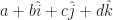
. Here a, b, c, and d are all real numbers. This is kind of sloppy; the pieces of a quaternion aren’t in fact vectors added together. But it is hard not to look at a quaternion and see something pointing in some direction, like the first vectors we ever learn about. And there are some problems in pointing-in-a-direction vectors that quaternions handle so well. (Mostly how to rotate one direction around another axis.) So a bit of vector notation seeps in where it isn’t appropriate.

I suppose there’s some value in pointing out that the ‘i’ and ‘j’ and ‘k’ in a quaternion are fixed and set numbers. They’re unlike an ‘a’ or an ‘x’ we might see in the expression. I’m not sure anyone was thinking they were, though. Notation is a tricky thing. It’s as hard to get sensible and consistent and clear as it is to make words and grammar sensible. But the hat is a simple one. It’s good to have something like that to rely on.

Something To Read: Galton Boards


I do need to take another light week of writing I’m afraid. There’ll be the Theorem Thursday post and all that. But today I’d like to point over to Gaurish4Math’s WordPress Blog, and a discussion of the Galton Board. I’m not familiar with it by that name, but it is a very familiar concept. You see it as Plinko boards on The Price Is Right and as a Boardwalk or amusement-park game. Set an array of pins on a vertical board and drop a ball or a round chip or something that can spin around freely on it. Where will it fall?

It’s random luck, it seems. At least it is incredibly hard to predict where, underneath all the pins, the ball will come to rest. Some of that is ignorance: we just don’t know the weight distribution of the ball, the exact way it’s dropped, the precise spacing of pins well enough to predict it all. We don’t care enough to do that. But some of it is real randomness. Ideally we make the ball bounce so many times that however well we estimated its drop, the tiny discrepancy between where the ball is and where we predict it is, and where it is going and where we predict it is going, will grow larger than the Plinko board and our prediction will be meaningless.

(I am not sure that this literally happens. It is possible, though. It seems more likely the more rows of pins there are on the board. But I don’t know how tall a board really needs to be to be a chaotic system, deterministic but unpredictable.)

But here is the wonder. We cannot predict what any ball will do. But we can predict something about what every ball will do, if we have enormously many of them. Gaurish writes some about the logic of why that is, and the theorems in probability that tell us why that should be so.

Reading the Comics, July 13, 2016: Catching Up On Vacation Week Edition


I confess I spent the last week on vacation, away from home and without the time to write about the comics. And it was another of those curiously busy weeks that happens when it’s inconvenient. I’ll try to get caught up ahead of the weekend. No promises.

Art and Chip Samson’s The Born Loser for the 10th talks about the statistics of body measurements. Measuring bodies is one of the foundations of modern statistics. Adolphe Quetelet, in the mid-19th century, found a rough relationship between body mass and the square of a person’s height, used today as the base for the body mass index.Francis Galton spent much of the late 19th century developing the tools of statistics and how they might be used to understand human populations with work I will describe as “problematic” because I don’t have the time to get into how much trouble the right mind at the right idea can be.

No attempt to measure people’s health with a few simple measurements and derived quantities can be fully successful. Health is too complicated a thing for one or two or even ten quantities to describe. Measures like height-to-waist ratios and body mass indices and the like should be understood as filters, the way temperature and blood pressure are. If one or more of these measurements are in dangerous ranges there’s reason to think there’s a health problem worth investigating here. It doesn’t mean there is; it means there’s reason to think it’s worth spending resources on tests that are more expensive in time and money and energy. And similarly just because all the simple numbers are fine doesn’t mean someone is perfectly healthy. But it suggests that the person is more likely all right than not. They’re guides to setting priorities, easy to understand and requiring no training to use. They’re not a replacement for thought; no guides are.

Jeff Harris’s Shortcuts educational panel for the 10th is about zero. It’s got a mix of facts and trivia and puzzles with a few jokes on the side.

I don’t have a strong reason to discuss Ashleigh Brilliant’s Pot-Shots rerun for the 11th. It only mentions odds in a way that doesn’t open up to discussing probability. But I do like Brilliant’s “Embrace-the-Doom” tone and I want to share that when I can.

John Hambrock’s The Brilliant Mind of Edison Lee for the 13th of July riffs on the world’s leading exporter of statistics, baseball. Organized baseball has always been a statistics-keeping game. The Olympic Ball Club of Philadelphia’s 1837 rules set out what statistics to keep. I’m not sure why the game is so statistics-friendly. It must be in part that the game lends itself to representation as a series of identical events — pitcher throws ball at batter, while runners wait on up to three bases — with so many different outcomes.

'Edison, let's discuss stats while we wait for the opening pitch.' 'Statistics? I have plenty of those. A hot dog has 400 calories and costs five dollars. A 12-ounce root beer has 38 grams of sugar.' 'I mean *player* stats.' 'Oh'. (To his grandfather instead) 'Did you know the average wait time to buy nachos is eight minutes and six seconds?'
John Hambrock’s The Brilliant Mind of Edison Lee for the 13th of July, 2016. Properly speaking, the waiting time to buy nachos isn’t a player statistic, but I guess Edison Lee did choose to stop talking to his father for it. Which is strange considering his father’s totally natural and human-like word emission ‘Edison, let’s discuss stats while we wait for the opening pitch’.

Alan Schwarz’s book The Numbers Game: Baseball’s Lifelong Fascination With Statistics describes much of the sport’s statistics and record-keeping history. The things recorded have varied over time, with the list of things mostly growing. The number of statistics kept have also tended to grow. Sometimes they get dropped. Runs Batted In were first calculated in 1880, then dropped as an inherently unfair statistic to keep; leadoff hitters were necessarily cheated of chances to get someone else home. How people’s idea of what is worth measuring changes is interesting. It speaks to how we change the ways we look at the same event.

Dana Summers’s Bound And Gagged for the 13th uses the old joke about computers being abacuses and the like. I suppose it’s properly true that anything you could do on a real computer could be done on the abacus, just, with a lot ore time and manual labor involved. At some point it’s not worth it, though.

Nate Fakes’s Break of Day for the 13th uses the whiteboard full of mathematics to denote intelligence. Cute birds, though. But any animal in eyeglasses looks good. Lab coats are almost as good as eyeglasses.

LERBE ( O O - O - ), GIRDI ( O O O - - ), TACNAV ( O - O - O - ), ULDNOA ( O O O - O - ). When it came to measuring the Earth's circumference, there was a ( - - - - - - - - ) ( - - - - - ).
David L Hoyt and Jeff Knurek’s Jumble for the 13th of July, 2016. The link will be gone sometime after mid-August I figure. I hadn’t thought of a student being baffled by using the same formula for an orange and a planet’s circumference because of their enormous difference in size. It feels authentic, though.

David L Hoyt and Jeff Knurek’s Jumble for the 13th is about one of geometry’s great applications, measuring how large the Earth is. It’s something that can be worked out through ingenuity and a bit of luck. Once you have that, some clever argument lets you work out the distance to the Moon, and its size. And that will let you work out the distance to the Sun, and its size. The Ancient Greeks had worked out all of this reasoning. But they had to make observations with the unaided eye, without good timekeeping — time and position are conjoined ideas — and without photographs or other instantly-made permanent records. So their numbers are, to our eyes, lousy. No matter. The reasoning is brilliant and deserves respect.

A Leap Day 2016 Mathematics A To Z: Z-score


And we come to the last of the Leap Day 2016 Mathematics A To Z series! Z is a richer letter than x or y, but it’s still not so rich as you might expect. This is why I’m using a term that everybody figured I’d use the last time around, when I went with z-transforms instead.

Z-Score

You get an exam back. You get an 83. Did you do well?

Hard to say. It depends on so much. If you expected to barely pass and maybe get as high as a 70, then you’ve done well. If you took the Preliminary SAT, with a composite score that ranges from 60 to 240, an 83 is catastrophic. If the instructor gave an easy test, you maybe scored right in the middle of the pack. If the instructor sees tests as a way to weed out the undeserving, you maybe had the best score in the class. It’s impossible to say whether you did well without context.

The z-score is a way to provide that context. It draws that context by comparing a single score to all the other values. And underlying that comparison is the assumption that whatever it is we’re measuring fits a pattern. Usually it does. The pattern we suppose stuff we measure will fit is the Normal Distribution. Sometimes it’s called the Standard Distribution. Sometimes it’s called the Standard Normal Distribution, so that you know we mean business. Sometimes it’s called the Gaussian Distribution. I wouldn’t rule out someone writing the Gaussian Normal Distribution. It’s also called the bell curve distribution. As the names suggest by throwing around “normal” and “standard” so much, it shows up everywhere.

A normal distribution means that whatever it is we’re measuring follows some rules. One is that there’s a well-defined arithmetic mean of all the possible results. And that arithmetic mean is the most common value to turn up. That’s called the mode. Also, this arithmetic mean, and mode, is also the median value. There’s as many data points less than it as there are greater than it. Most of the data values are pretty close to the mean/mode/median value. There’s some more as you get farther from this mean. But the number of data values far away from it are pretty tiny. You can, in principle, get a value that’s way far away from the mean, but it’s unlikely.

We call this standard because it might as well be. Measure anything that varies at all. Draw a chart with the horizontal axis all the values you could measure. The vertical axis is how many times each of those values comes up. It’ll be a standard distribution uncannily often. The standard distribution appears when the thing we measure satisfies some quite common conditions. Almost everything satisfies them, or nearly satisfies them. So we see bell curves so often when we plot how frequently data points come up. It’s easy to forget that not everything is a bell curve.

The normal distribution has a mean, and median, and mode, of 0. It’s tidy that way. And it has a standard deviation of exactly 1. The standard deviation is a way of measuring how spread out the bell curve is. About 95 percent of all observed results are less than two standard deviations away from the mean. About 99 percent of all observed results are less than three standard deviations away. 99.9997 percent of all observed results are less than six standard deviations away. That last might sound familiar to those who’ve worked in manufacturing. At least it des once you know that the Greek letter sigma is the common shorthand for a standard deviation. “Six Sigma” is a quality-control approach. It’s meant to make sure one understands all the factors that influence a product and controls them. This is so the product falls outside the design specifications only 0.0003 percent of the time.

This is the normal distribution. It has a standard deviation of 1 and a mean of 0, by definition. And then people using statistics go and muddle the definition. It is always so, with the stuff people actually use. Forgive them. It doesn’t really change the shape of the curve if we scale it, so that the standard deviation is, say, two, or ten, or π, or any positive number. It just changes where the tick marks are on the x-axis of our plot. And it doesn’t really change the shape of the curve if we translate it, adding (or subtracting) some number to it. That makes the mean, oh, 80. Or -15. Or eπ. Or some other number. That just changes what value we write underneath the tick marks on the plot’s x-axis. We can find a scaling and translation of the normal distribution that fits whatever data we’re observing.

When we find the z-score for a particular data point we’re undoing this translation and scaling. We figure out what number on the standard distribution maps onto the original data set’s value. About two-thirds of all data points are going to have z-scores between -1 and 1. About nineteen out of twenty will have z-scores between -2 and 2. About 99 out of 100 will have z-scores between -3 and 3. If we don’t see this, and we have a lot of data points, then that’s suggests our data isn’t normally distributed.

I don’t know why the letter ‘z’ is used for this instead of, say, ‘y’ or ‘w’ or something else. ‘x’ is out, I imagine, because we use that for the original data. And ‘y’ is a natural pick for a second measured variable. z’, I expect, is just far enough from ‘x’ it isn’t needed for some more urgent duty, while being close enough to ‘x’ to suggest it’s some measured thing.

The z-score gives us a way to compare how interesting or unusual scores are. If the exam on which we got an 83 has a mean of, say, 74, and a standard deviation of 5, then we can say this 83 is a pretty solid score. If it has a mean of 78 and a standard deviation of 10, then the score is better-than-average but not exceptional. If the exam has a mean of 70 and a standard deviation of 4, then the score is fantastic. We get to meaningfully compare scores from the measurements of different things. And so it’s one of the tools with which statisticians build their work.

Reading the Comics, March 14, 2016: Pi Day Comics Event


Comic Strip Master Command had the regular pace of mathematically-themed comic strips the last few days. But it remembered what the 14th would be. You’ll see that when we get there.

Ray Billingsley’s Curtis for the 11th of March is a student-resists-the-word-problem joke. But it’s a more interesting word problem than usual. It’s your classic problem of two trains meeting, but rather than ask when they’ll meet it asks where. It’s just an extra little step once the time of meeting is made, but that’s all right by me. Anything to freshen the scenario up.

'Please answer this math question, Mr Wilkins. John is traveling east from San Francisco on a train at a speed of 80 miles per hour. Tom is going to that same meeting from New York, headed west, on a train traveling 100 miles per hour. In what state will they meet?' 'Couldn't they just Skype?'
Ray Billingsley’s Curtis for the 11th of March, 2016. I am curious what the path of the rail line is.

Tony Carrillo’s F Minus for the 11th was apparently our Venn Diagram joke for the week. I’m amused.

Mason Mastroianni, Mick Mastroianni, and Perri Hart’s B.C. for the 12th of March name-drops statisticians. Statisticians are almost expected to produce interesting pictures of their results. It is the field that gave us bar charts, pie charts, scatter plots, and many more. Statistics is, in part, about understanding a complicated set of data with a few numbers. It’s also about turning those numbers into recognizable pictures, all in the hope of finding meaning in a confusing world (ours).

Brian Anderson’s Dog Eat Doug for the 13th of March uses walls full of mathematical scrawl as signifier for “stuff thought deeply about’. I don’t recognize any of the symbols specifically, although some of them look plausibly like calculus. I would not be surprised if Anderson had copied equations from a book on string theory. I’d do it to tell this joke.

And then came the 14th of March. That gave us a bounty of Pi Day comics. Among them:

'Happy Pi Day.' 'Mmm. I love apple pie.' 'Pi day, not Pie Day. Pi ... you know ... 3.14 ... March 14th. Get it?' 'Today is a pie-eating holiday?' 'Sort of. They do celebrate it with pie, but it's mostly about pi.' 'I don't understand what that kid says half the time.'
John Hambrock’s The Brilliant Mind of Edison Lee for the 14th of March, 2016. The strip is like this a lot.

John Hambrock’s The Brilliant Mind of Edison Lee trusts that the name of the day is wordplay enough.

Scott Hilburn’s The Argyle Sweater is also a wordplay joke, although it’s a bit more advanced.

Tim Rickard’s Brewster Rockit fuses the pun with one of its running, or at least rolling, gags.

Bill Whitehead’s Free Range makes an urban legend out of the obsessive calculation of digits of π.

And Missy Meyer’s informational panel cartoon Holiday Doodles mentions that besides “National” Pi Day it was also “National” Potato Chip Day, “National” Children’s Craft Day, and “International” Ask A Question Day. My question: for the first three days, which nation?

Edited To Add: And I forgot to mention, after noting to myself that I ought to mention it. The Price Is Right (the United States edition) hopped onto the Pi Day fuss. It used the day as a thematic link for its Showcase prize packages, noting how you could work out π from the circumference of your new bicycles, or how π was a letter from your vacation destination of Greece, and if you think there weren’t brand-new cars in both Showcases you don’t know the game show well. Did anyone learn anything mathematical from this? I am skeptical. Do people come away thinking mathematics is more fun after this? … Conceivably. At least it was a day fairly free of people declaring they Hate Math and Can Never Do It.

How 2015 Treated My Mathematics Blog


Oh yeah, I also got one of these. WordPress put together a review of what all went on around here last year. The most startling thing to me is that I had 188 posts over the course of the year. A lot of that is thanks to the A To Z project, which gave me something to post each day for 31 days in a row. If I’d been thinking just a tiny bit harder I’d have come up with two more posts and made a clean sweep of June.

The unit of comparison for my readership this year was the Sydney Opera House. That’s a great comparison because everybody thinks they know how big an opera house is. It reminds me of a bit in Carl Sagan and and Ann Druyan’s Comet in which they compare the speed of an Oort cloud comet puttering around the sun to the speed of a biplane. We may have only a foggy idea how fast that is (I guess maybe a hundred miles per hour?) but it sounds nice and homey.

Reading the Comics, December 30, 2015: Seeing Out The Year Edition


There’s just enough comic strips with mathematical themes that I feel comfortable doing a last Reading the Comics post for 2015. And as maybe fits that slow week between Christmas and New Year’s, there’s not a lot of deep stuff to write about. But there is a Jumble puzzle.

Keith Tutt and Daniel Saunders’s Lard’s World Peace Tips gives us someone so wrapped up in measuring data as to not notice the obvious. The obvious, though, isn’t always right. This is why statistics is a deep and useful field. It’s why measurement is a powerful tool. Careful measurement and statistical tools give us ways to not fool ourselves. But it takes a lot of sampling, a lot of study, to give those tools power. It can be easy to get lost in the problems of gathering data. Plus numbers have this hypnotic power over human minds. I understand Lard’s problem.

Zach Weinersmith’s Saturday Morning Breakfast Cereal for the 27th of December messes with a kid’s head about the way we know 1 + 1 equals 2. The classic Principia Mathematica construction builds it out of pure logic. We come up with an idea that we call “one”, and another that we call “plus one”, and an idea we call “two”. If we don’t do anything weird with “equals”, then it follows that “one plus one equals two” must be true. But does the logic mean anything to the real world? Or might we be setting up a game with no relation to anything observable? The punchy way I learned this question was “one cup of popcorn added to one cup of water doesn’t give you two cups of soggy popcorn”. So why should the logical rules that say “one plus one equals two” tell us anything we might want to know about how many apples one has?

Words: LIHWE, CAQUK, COYKJE, TALAFO. Unscramble to - - - O O, O O - - -, - - - - - O, - - O - O -, and solve the puzzle: 'The math teacher liked teaching addition and subtraction - - - - - - -'.
David L Hoyt and Jeff Knurek’s Jumble for the 28th of December, 2015. The link will probably expire in late January 2016.

David L Hoyt and Jeff Knurek’s Jumble for the 28th of December features a mathematics teacher. That’s enough to include here. (You might have an easier time getting the third and fourth words if you reason what the surprise-answer word must be. You can use that to reverse-engineer what letters have to be in the circles.)

Richard Thompson’s Richard’s Poor Almanac for the 28th of December repeats the Platonic Fir Christmas Tree joke. It’s in color this time. Does the color add to the perfection of the tree, or take away from it? I don’t know how to judge.

A butterfly tells another 'you *should* feel guilty --- the flutter of your wings ended up causing a hurricane that claimed thousands of lives!'
Rina Piccolo filling in for Hilary Price on Rhymes With Orange for the 29th of December, 2015. It’s a small thing but I always like the dog looking up in the title panel for Cartoonist Showcase weeks.

Hilary Price’s Rhymes With Orange for the 29th of December gives its panel over to Rina Piccolo. Price often has guest-cartoonist weeks, which is a generous use of her space. Piccolo already has one and a sixth strips — she’s one of the Six Chix cartoonists, and also draws the charming Tina’s Groove — but what the heck. Anyway, this is a comic strip about the butterfly effect. That’s the strangeness by which a deterministic system can still be unpredictable. This counter-intuitive conclusion dates back to the 1890s, when Henri Poincaré was trying to solve the big planetary mechanics question. That question is: is the solar system stable? Is the Earth going to remain in about its present orbit indefinitely far into the future? Or might the accumulated perturbations from Jupiter and the lesser planets someday pitch it out of the solar system? Or, less likely, into the Sun? And the sad truth is, the best we can say is we can’t tell.

In Brian Anderson’s Dog Eat Doug for the 30th of December, Sophie ponders some deep questions. Most of them are purely philosophical questions and outside my competence. “What are numbers?” is also a philosophical question, but it feels like something a mathematician ought to have a position on. I’m not sure I can offer a good one, though. Numbers seem to be to be these things which we imagine. They have some properties and that obey certain rules when we combine them with other numbers. The most familiar of these numbers and properties correspond with some intuition many animals have about discrete objects. Many times over we’ve expanded the idea of what kinds of things might be numbers without losing the sense of how numbers can interact, somehow. And those expansions have generally been useful. They strangely match things we would like to know about the real world. And we can discover truths about these numbers and these relations that don’t seem to be obviously built into the definitions. It’s almost as if the numbers were real objects with the capacity to surprise and to hold secrets.

Why should that be? The lazy answer is that if we came up with a construct that didn’t tell us anything interesting about the real world, we wouldn’t bother studying it. A truly irrelevant concept would be a couple forgotten papers tucked away in an unread journal. But that is missing the point. It’s like answering “why is there something rather than nothing” with “because if there were nothing we wouldn’t be here to ask the question”. That doesn’t satisfy. Why should it be possible to take some ideas about quantity that ravens, raccoons, and chimpanzees have, then abstract some concepts like “counting” and “addition” and “multiplication” from that, and then modify those concepts, and finally have the modification be anything we can see reflected in the real world? There is a mystery here. I can’t fault Sophie for not having an answer.

A Summer 2015 Mathematics A to Z Roundup


Since I’ve run out of letters there’s little dignified to do except end the Summer 2015 Mathematics A to Z. I’m still organizing my thoughts about the experience. I’m quite glad to have done it, though.

For the sake of good organization, here’s the set of pages that this project’s seen created:

Reading the Comics, July 12, 2015: Chuckling At Hart Edition


I haven’t had the chance to read the Gocomics.com comics yet today, but I’d had enough strips to bring up anyway. And I might need something to talk about on Tuesday. Two of today’s strips are from the legacy of Johnny Hart. Hart’s last decades at especially B.C., when he most often wrote about his fundamentalist religious views, hurt his reputation and obscured the fact that his comics were really, really funny when they start. His heirs and successors have been doing fairly well at reviving the deliberately anachronistic and lightly satirical edge that made the strips funny to begin with, and one of them’s a perennial around here. The other, Wizard of Id Classics, is literally reprints from the earliest days of the comic strip’s run. That shows the strip when it was earning its place on every comics page everywhere, and made a good case for it.

Mason Mastroianni, Mick Mastroianni, and Perri Hart’s B.C. (July 8) shows how a compass, without straightedge, can be used to ensure one’s survival. I suppose it’s really only loosely mathematical but I giggled quite a bit.

Ken Cursoe’s Tiny Sepuku (July 9) talks about luck as being just the result of probability. That’s fair enough. Random chance will produce strings of particularly good, or bad, results. Those strings of results can look so long or impressive that we suppose they have to represent something real. Look to any sport and the argument about whether there are “hot hands” or “clutch performers”. And Maneki-Neko is right that a probability manipulator would help. You can get a string of ten tails in a row on a fair coin, but you’ll get many more if the coin has an eighty percent chance of coming up tails.

Brant Parker and Johnny Hart’s Wizard of Id Classics (July 9, rerun from July 12, 1965) is a fun bit of volume-guessing and logic. So, yes, I giggled pretty solidly at both B.C. and The Wizard of Id this week.

Mell Lazarus’s Momma (July 11) identifies “long division” as the first thing a person has to master to be an engineer. I don’t know that this is literally true. It’s certainly true that liking doing arithmetic helps one in a career that depends on calculation, though. But you can be a skilled songwriter without being any good at writing sheet music. I wouldn’t be surprised if there are skilled engineers who are helpless at dividing fourteen into 588.

In the panel of interest, Loretta says the numbers (presumably the bills) don't add up, but they subtract down fine.
Bunny Hoest and John Reiner’s Lockhorns for the 12th of July, 2015.

Bunny Hoest and John Reiner’s Lockhorns (July 12) includes an example of using “adding up” to mean “make sense”. It’s a slight thing. But the same idiom was used last week, in Eric Teitelbaum and Bill Teitelbaum’s Bottomliners. I don’t think Comic Strip Master Command is ordering this punch line yet, but you never know.

And finally, I do want to try something a tiny bit new, and explicitly invite you-the-readers to say what strip most amused you. Please feel free to comment about your choices, r warn me that I set up the poll wrong. I haven’t tried this before.

A Summer 2015 Mathematics A To Z: quintile


Quintile.

Why is there statistics?

There are many reasons statistics got organized as a field of study mostly in the late 19th and early 20th century. Mostly they reflect wanting to be able to say something about big collections of data. People can only keep track of so much information at once. Even if we could keep track of more information, we’re usually interested in relationships between pieces of data. When there’s enough data there are so many possible relationships that we can’t see what’s interesting.

One of the things statistics gives us is a way of representing lots of data with fewer numbers. We trust there’ll be few enough numbers we can understand them all simultaneously, and so understand something about the whole data.

Quintiles are one of the tools we have. They’re a lesser tool, I admit, but that makes them sound more exotic. They’re descriptions of how the values of a set of data are distributed. Distributions are interesting. They tell us what kinds of values are likely and which are rare. They tell us also how variable the data is, or how reliably we are measuring data. These are things we often want to know: what is normal for the thing we’re measuring, and what’s a normal range?

We get quintiles from imagining the data set placed in ascending order. There’s some value that one-fifth of the data points are smaller than, and four-fifths are greater than. That’s your first quintile. Suppose we had the values 269, 444, 525, 745, and 1284 as our data set. The first quintile would be the arithmetic mean of the 269 and 444, that is, 356.5.

The second quintile is some value that two-fifths of your data points are smaller than, and that three-fifths are greater than. With that data set we started with that would be the mean of 444 and 525, or 484.5.

The third quintile is a value that three-fifths of the data set is less than, and two-fifths greater than; in this case, that’s 635.

And the fourth quintile is a value that four-fifths of the data set is less than, and one-fifth greater than. That’s the mean of 745 and 1284, or 1014.5.

From looking at the quintiles we can say … well, not much, because this is a silly made-up problem that demonstrates how quintiles are calculated rather instead of why we’d want to do anything with them. At least the numbers come from real data. They’re the word counts of my first five A-to-Z definitions. But the existence of the quintiles at 365.5, 484.5, 635, and 1014.5, along with the minimum and maximum data points at 269 and 1284, tells us something. Mostly that numbers are bunched up in the three and four hundreds, but there could be some weird high numbers. If we had a bigger data set the results would be less obvious.

If the calculating of quintiles sounds much like the way we work out the median, that’s because it is. The median is the value that half the data is less than, and half the data is greater than. There are other ways of breaking down distributions. The first quartile is the value one-quarter of the data is less than. The second quartile a value two-quarters of the data is less than (so, yes, that’s the median all over again). The third quartile is a value three-quarters of the data is less than.

Percentiles are another variation on this. The (say) 26th percentile is a value that 26 percent — 26 hundredths — of the data is less than. The 72nd percentile a value greater than 72 percent of the data.

Are quintiles useful? Well, that’s a loaded question. They are used less than quartiles are. And I’m not sure knowing them is better than looking at a spreadsheet’s plot of the data. A plot of the data with the quintiles, or quartiles if you prefer, drawn in is better than either separately. But these are among the tools we have to tell what data values are likely, and how tightly bunched-up they are.

How May 2015 Treated My Mathematics Blog


For May 2015 I tried a new WordPress theme — P2 Classic — and I find I rather like it. Unfortunately it seems to be rubbish on mobile devices and I’m not WordPress Theme-equipped-enough to figure out how to fix that. I’m sorry, mobile readers. I’m honestly curious whether the theme change affected my readership, which was down appreciably over May.

According to WordPress, the number of pages viewed here dropped to 936 in May, down just over ten percent from April’s 1047 and also below March’s 1022. Perhaps the less-mobile-friendly theme was shooing people away. Maybe not, though: in March and April I’d posted 14 articles each, while in May there were a mere twelve. The number of views per post increased steadily, from 73 in March to just under 75 in April to 78 in May. I’m curious if this signifies anything. I may get some better idea next month. June should have at least 13 posts from the Mathematics A To Z gimmick, plus this statistics post, and there’ll surely be at least two Reading The Comics posts, or at least sixteen posts. And who knows what else I’ll feel like throwing in? It’ll be an interesting experiment at least.

Anyway, the number of unique visitors rose to 415 in May, up from April’s 389 but still below March’s 468. The number of views per visitor dropped to 2.26, far below April’s 2.68, but closer in line with March’s 2.18. And 2.26 is close to the normal count for this sort of thing.

The number of likes on posts dropped to 259. In April it was 296 likes and in March 265. That may just reflect the lower number of posts, though. Divide the number of likes by the number of posts and March saw an average of 18.9, April 21.14, and May 21.58. That’s all at least consistent, although there’s not much reason to suppose that only things from the current month were liked.

The number of comments recovered also. May saw 83 comments, up from April’s 64, but not quite back to March’s 93. That comes to, for May, 6.9 comments for each post, but that’s got to be counting links to other posts, including pingbacks and maybe the occasional reblogging. I’ve been getting chattier with folks around here, but not seven comments per post chatty.

June starts at 24,820 views, and 485 people following specifically through WordPress.

I’ve got a healthy number of popular posts the past month; all of these got at least 37 page views each. I cut off at 37 because that’s where the Trapezoids one came in and we already know that’s popular. More popular than that were:

I have the suspicion that comics fans are catching on, quietly, to all this stuff.

Now the countries report. The nations sending me at least twenty page views were the United States (476), the United Kingdom (85), Canada (65), Italy (53), and Austria (20).

Sending just a single reader were Belgium, Bulgaria, Colombia, Nigeria, Norway, Pakistan, Romania, and Vietnam. Romania is on a three-month single-reader streak; Vietnam, two. India sent me a mere two readers, down from six last month. The European Union sent me three.

And among the interesting search terms this past month were:

  • origin is the gateway to your entire gaming universe.
  • how to do a cube box (the cube is easy enough, it’s getting the boxing gloves on that’s hard)
  • popeye “computer king” (Remember that comic?)
  • google can you show me in 1 trapezoid how many cat how many can you make of 2 (?, although I like the way Google is named at the start of the query, like someone on Next Generation summoning the computer)
  • plato “divided line” “arthur cayley” (I believe that mathematics comes in on the lower side of the upper half of Plato’s divided line)
  • where did negative numbers originate from

Someday I must work out that “origin is the gateway” thing.

How April 2015 Treated My Mathematics Blog


(I apologize if the formatting is messed up. For some reason preview is not working, and I will not be trying the new page for entering posts if I can at all help it. I will fix when I can, if it needs fixing.)

As it’s the start of the month I want to try understanding the readership of my blogs, as WordPress gives me statistics. It’s been a more confusing month than usual, though. One thing is easy to say: the number of pages read was 1,047, an all-time high around these parts for a single month. It’s up from 1,022 in March, and 859 in February. And it’s the second month in a row there’ve been more than a thousand readers. That part’s easy.

The number of visitors has dropped. It was down to 389 in April, from a record 468 in March and still-higher 407 in April. This is, if WordPress doesn’t lead me awry, my fifth-highest number of viewers. This does mean the number of views per visitor was my highest since June of 2013. The blog had 2.69 views per visitor, compared to 2.18 in March and 2.11 in February. It’s one of my highest views-per-visitor on record anyway. Perhaps people quite like what they see and are archive-binging. I approve of this. I’m curious why the number of readers dropped so, though, particularly when I look at my humor blog statistics (to be posted later).

I’m confident the readers are there, though. The number of likes on my mathematics blog was 297, up from March’s 265 and February’s 179. It’s the highest on record far as WordPress will tell me. So readers are more engaged, or else they’re clicking like from the WordPress Reader or an RSS feed. Neither gets counted as a page view or a visitor. That’s another easy part. The number of comments is down to 64, from March’s record 93, but March seems to have been an exceptional month. February had 56 comments so I’m not particularly baffled by April’s drop.

May starts out with 23,884 total views, and 472 people following specifically through WordPress.

It’s a truism that my most popular posts are the trapezoids one and the Reading The Comics posts, but for April that was incredibly true. Most popular the past thirty days were:

  1. How Many Trapezoids I Can Draw.
  2. Reading The Comics, April 10, 2015: Getting Into The Story Problem Edition.
  3. Reading The Comics, April 15, 2015: Tax Day Edition.
  4. Reading The Comics, April 20, 2015: History Of Mathematics Edition.
  5. Reading The Comics, March 31, 2015: Closing Out March Edition.

I am relieved that I started giving all these Comics posts their own individual “Edition” titles. Otherwise there’d be no way to tell them apart.

The nations sending me the most readers were, as ever, the United States (662), Canada (82), and the United Kingdom (47), with Slovenia once again strikingly high (36). Hong Kong came in with 24 readers, Italy 23, and Austria a mere 18. Elke Stangl’s had a busy month, I know.

This month’s single-reader countries were Czech Republic, Morocco, the Netherlands, Puerto Rico, Romania, Taiwan, and Vietnam. Romania’s the only one that sent me a single reader last month. India bounced back from five readers to six.

Among the search terms bringing people to me were no poems. Among the interesting phrases were:

  • what point is driving the area difference between two triangles (A good question!)
  • how do you say 1,898,600,000,000,000,000,000,000,000 (I almost never do.)
  • is julie larson still drawing the dinette set (Yes, to the best of my knowledge.)
  • jpe fast is earth spinning? (About once per day, although the answer can be surprisingly difficult to say! But also figure about 465 times the cosine of your latitude meters per second, roughly.)
  • origin is the gateway to your entire gaming universe. (Again, I don’t know what this means, and I’m a little scared to find out.)
  • i hate maths 2015 photos (Well, that just hurts.)
  • getting old teacher jokes (Again, that hurts, even if it’s not near my birthday.)
  • two trapezoids make a (This could be a poem, actually.)
  • how to draw 2 trapezoids (I’d never thought about that one. Shall have to consider writing it.)

I don’t know quite what it all means, other than that I need to write about comic strips and trapezoids more somehow.

How Not To Count Fish


I’d discussed a probability/sampling-based method to estimate the number of fish that might be in our pond out back, and then some of the errors that have to be handled if you want to have a reliable result. Now, I want to get into why the method doesn’t work, at least not without much greater insight into goldfish behavior than simply catching a couple and releasing them will do.

Catching a sample, re-releasing it, and counting how many of that sample we re-catch later on is a logically valid method, provided certain assumptions the method requires are accurately — or at least accurately enough — close to the way the actual thing works. Here are some of the ways goldfish fall short of the ideal.

First faulty assumption: Goldfish are perfectly identical. In this goldfish-trapped we make the assumption that there is some, fixed, constant probability of a goldfish being caught in the net. We have to assume that this is the same number for every goldfish, and that it doesn’t change as goldfish go through the experience of getting caught and then released. But goldfish have personality, as you learn if you have a bunch in a nice setting and do things like try feeding them koi treats or introduce something new like a wire-mesh trap to their environment. Some are adventurous and will explore the unfamiliar thing; some are shy and will let everyone else go first and then maybe not bother going at all. I empathize with both positions.

If there are enough goldfish, the variation between personalities is probably not going to matter much. There’ll be some that are easy to catch, and they’ll probably be roughly as common as the ones who can’t be coaxed into the trap at all. It won’t be exactly balanced unless we’re very lucky, but this would probably only throw off our calculations a little bit.

Whether the goldfish learn, and become more, or less, likely to be trapped in time is harder. Goldfish do learn, certainly, although it’s not obvious to me that the trapping and releasing experience would be one they draw much of a lesson from. It’s only a little inconvenience, really, and not at all harmful; what should they learn? Other than that there’s maybe an easy bit of food to be had here so why not go in? So this might change their behavior and it’s hard to predict how.

(I note that animal capture studies get quite frustrated when the animals start working out how to game the folks studying them. Bil Gilbert’s early-70s study of coatis — Latin American raccoons, written up in the lovely popularization Chulo: A Year Among The Coatimundis — was plagued by some coatis who figured out going into the trap was an easy, safe meal they’d be released from without harm, and wouldn’t go back about their business and leave room for other specimens.)

Second faulty assumption: Goldfish are not perfectly identical. This is the biggest challenge to counting goldfish population by re-catching a sample of them. How do you know if you caught a goldfish before? When they grow to adulthood, it’s not so bad, since they grow fairly distinctive patterns of orange and white and black and such, and they’ll usually settle into different sizes. (That said, we do have two adult fish who were very distinct when we first got them, but who’ve grown into near-twins.)

But baby goldfish? They’re basically all tiny black things, meant to hide into the mud at the bottom of ponds and rivers — their preferred habitat — and pretty near indistinguishable. As they get larger they get distinguishable, a bit, and start to grow patterns, but for the vast number of baby fish there’s just no telling one from another.

When we were trying to work out whether some mice we found in the house were ones we had previously caught and put out in the garage, we were able to mark them by squiring some food dye at their heads as they were released. The mice would rub the food dye from their heads onto their whole bodies and it would take a while before the dye would completely fade out. (We didn’t re-catch any mice, although it’s hard to dye a wild mouse efficiently because they will take off like bullets. Also one time when we thought we’d captured one there were actually three in the humane trap and you try squiring the food dye bottle at two more mice than you thought were there, fleeing.) But you can see how the food dye wouldn’t work here. Animal researchers with a budget might go on to attach collars or somehow otherwise mark animals, but if there’s a way to mark and track goldfish with ordinary household items I can’t think of it.

(No, we will not be taking the bits of americium in our smoke detectors out and injecting them into trapped goldfish; among the objections, I don’t have a radioactivity detector.)

Third faulty assumption: Goldfish are independent entities. The first two faulty assumptions are ones that could be kind of worked around. If there’s enough goldfish then the distribution of how likely any one is to get caught will probably be near enough normal that we can pretend there’s an identical chance of catching each, and if we really thought about it we could probably find some way of marking goldfish to tell if we re-caught any. Independence, though; this is the point on which so many probability-based schemes fall.

Independence, in the language of probability, is the principle that one thing’s happening does not affect the likelihood of another thing happening. For our problem, it’s the assumption that one goldfish being caught does not make it any more or less likely that another goldfish will be caught. We like independence, in studying probability. It makes so many problems easier to study, or even possible to study, and it often seems like a reasonable supposition.

A good number of interesting scientific discoveries amount to finding evidence that two things are not actually independent, and that one thing happening makes it more (or less) likely the other will. Sometimes these turn out to be vapor — there was a 19th-century notion suggesting a link between sunspot activity and economic depressions (because sunspots correlate to solar activity, which could affect agriculture, and up to 1893 the economy and agriculture were pretty much the same thing) — but when there is a link the results can be profound, as see the smoking-and-cancer link, or for something promising but still (to my understanding) under debate, the link between leaded gasoline and crime rates.

How this applies to the goldfish population problem, though, is that goldfish are social creatures. They school, loosely, forming and re-forming groups, and would much rather be around another goldfish than not. Even as babies they form these adorable tiny little schools; that may be in the hopes that someone else will get eaten by a bigger fish, but they keep hanging around other fish their own size through their whole lives. If there’s a goldfish inside the trap, it is hard to believe that other goldfish are not going to follow it just to be with the company.

Indeed, the first day we set out the trap for the winter, we pulled in all but one of the adult fish, all of whom apparently followed the others into the enclosure. I’m sorry I couldn’t photograph that because it was both adorable and funny to see so many fish just station-keeping beside one another — they were even all looking in the same direction — and waiting for whatever might happen next. Throughout the months we were able to spend bringing in fish, the best bait we could find was to have one fish already in the trap, and a couple days we did leave one fish in a few more hours or another night so that it would be joined by several companions the next time we checked.

So that’s something which foils the catch and re-catch scheme: goldfish are not independent entities. They’re happy to follow one another into trap. I would think the catch and re-catch scheme should be salvageable, if it were adapted to the way goldfish actually behave. But that requires a mathematician admitting that he can’t just blunder into a field with an obvious, simple scheme to solve a problem, and instead requires the specialized knowledge and experience of people who are experts in the field, and that of course can’t be done. (For example, I don’t actually know that goldfish behavior is sufficiently non-independent as to make an important difference in a population estimate of this kind. But someone who knew goldfish or carp well could tell me, or tell me how to find out.)

Several dozen goldfish, most of them babies, within a 150-gallon rubber stock tank, their wintering home.
Goldfish brought indoors, to a stock tank, for the winter.

For those curious how the goldfish worked out, though, we were able to spend about two and a half months catching fish before the pond froze over for the winter, though the number we caught each week dropped off as the temperature dropped. We have them floating about in a stock tank in the basement, waiting for the coming of spring and the time the pond will be warm enough for them to re-occupy it. We also know that at least some of the goldfish we didn’t catch made it to, well, about a month ago. I’d seen one of the five orange baby fish who refused to go into the trap through a hole in the ice then. It was holding close to the bottom but seemed to be in good shape.

This coming year should be an exciting one for our fish population.

Reading the Comics, February 14, 2015: Valentine’s Eve Edition


I haven’t had the chance to read today’s comics, what with it having snowed just enough last night that we have to deal with it instead of waiting for the sun to melt it, so, let me go with what I have. There’s a sad lack of strips I feel justified including the images of, since they’re all Gocomics.com representatives and I’m used to those being reasonably stable links. Too bad.

Eric the Circle has a pair of strips by Griffinetsabine, the first on the 7th of February, and the next on February 13, both returning to “the Shape Single’s Bar” and both working on “complementary angles” for a pun. That all may help folks remember the difference between complementary angles — those add up to a right angle — and supplementary angles — those add up to two right angles, a straight line — although what it makes me wonder is the organization behind the Eric the Circle art collective. It hasn’t got any nominal author, after all, and there’s what appear to be different people writing and often drawing it, so, who does the scheduling so that the same joke doesn’t get repeated too frequently? I suppose there’s some way of finding that out for myself, but this is the Internet, so it’s easier to admit my ignorance and let the answer come up to me.

Mark Anderson’s Andertoons (February 10) surprised me with a joke about the Dewey decimal system that I hadn’t encountered before. I don’t know how that happened; it just did. This is, obviously, a use of decimal that’s distinct from the number system, but it’s so relatively rare to think of decimals as apart from representations of numbers that pointing it out has the power to surprise me at least.

Continue reading “Reading the Comics, February 14, 2015: Valentine’s Eve Edition”

Reading the Comics, January 24, 2015: Many, But Not Complicated Edition


I’m sorry to have fallen behind on my mathematics-comics posts, but I’ve been very busy wielding a cudgel at Microsoft IIS all week in the service of my day job. And since I telecommute it’s quite hard to convincingly threaten the server, however much it deserves it. Sorry. Comic Strip Master Command decided to send me three hundred billion gazillion strips, too, so this is going to be a bit of a long post.

Jenny Campbell’s Flo and Friends (January 19) is almost a perfect example of the use of calculus as a signifier of “something really intelligent people think of”. Which is flattening to mathematicians, certainly, although I worry that attitude does make people freeze up in panic when they hear that they have to take calculus.

The Amazing Yet Tautological feature of Ruben Bolling’s Super-Fun-Pak Comix (January 19) lives up to its title, at least provided we are all in agreement about what “average” means. From context this seems to be the arithmetic mean — that’s usually what people, mathematicians included mean by “average” if they don’t specify otherwise — although you can produce logical mischief by slipping in an alternate average, such as the “median” — the amount that half the results are less than and half are greater than — or the “mode” — the most common result. There are other averages too, but they’re not so often useful. On the 21st Super-Fun-Pak Comix returned with another installation of Chaos Butterfly, by the way.

Continue reading “Reading the Comics, January 24, 2015: Many, But Not Complicated Edition”

WordPress’s 2014 in review, Mathematics Blog Edition


It’s a little more formal than my usual monthly roundups, but WordPress makes this nice little animated report and everything for the year as a whole, and I’d like to share it now while I work on the first mathematics-comics roundup for 2015.

A static scene of fireworks to tease people into the whole (visual) report.

Here's an excerpt:

A New York City subway train holds 1,200 people. This blog was viewed about 7,000 times in 2014. If it were a NYC subway train, it would take about 6 trips to carry that many people.

Here’s the complete report.

Reading the Comics, December 27, 2014: Last of the Year Edition?


I’m curious whether this is going to be the final bunch of mathematics-themed comics for the year 2014. Given the feast-or-famine nature of the strips it’s plausible we might not have anything good through to mid-January, but, who knows? Of the comics in this set I think the first Peanuts the most interesting to me, since it’s funny and gets at something big and important, although the Ollie and Quentin is a better laugh.

Mark Leiknes’s Cow and Boy (December 23, rerun) talks about chaos theory, the notion that incredibly small differences in a state can produce enormous differences in a system’s behavior. Chaos theory became a pop-cultural thing in the 1980s, when Edward Lorentz’s work (of twenty years earlier) broke out into public consciousness. In chaos theory the chaos isn’t that the system is unpredictable — if you have perfect knowledge of the system, and the rules by which it interacts, you could make perfect predictions of its future. What matters is that, in non-chaotic systems, a small error will grow only slightly: if you predict the path of a thrown ball, and you have the ball’s mass slightly wrong, you’ll make a proportionately small error on what the path is like. If you predict the orbit of a satellite around a planet, and have the satellite’s starting speed a little wrong, your prediction is proportionately wrong. But in a chaotic system there are at least some starting points where tiny errors in your understanding of the system produce huge differences between your prediction and the actual outcome. Weather looks like it’s such a system, and that’s why it’s plausible that all of us change the weather just by existing, although of course we don’t know whether we’ve made it better or worse, or for whom.

Charles Schulz’s Peanuts (December 23, rerun from December 26, 1967) features Sally trying to divide 25 by 50 and Charlie Brown insisting she can’t do it. Sally’s practical response: “You can if you push it!” I am a bit curious why Sally, who’s normally around six years old, is doing division in school (and over Christmas break), but then the kids are always being assigned Thomas Hardy’s Tess of the d’Urbervilles for a book report and that is hilariously wrong for kids their age to read, so, let’s give that a pass.

Continue reading “Reading the Comics, December 27, 2014: Last of the Year Edition?”

Gaussian distribution of NBA scores


The Prior Probability blog points out an interesting graph, showing the most common scores in basketball teams, based on the final scores of every NBA game. It’s actually got three sets of data there, one for all basketball games, one for games this decade, and one for basketball games of the 1950s. Unsurprisingly there’s many more results for this decade — the seasons are longer, and there are thirty teams in the league today, as opposed to eight or nine in 1954. (The Baltimore Bullets played fourteen games before folding, and the games were expunged from the record. The league dropped from eleven teams in 1950 to eight for 1954-1959.)

I’m fascinated by this just as a depiction of probability distributions: any team can, in principle, reach most any non-negative score in a game, but it’s most likely to be around 102. Surely there’s a maximum possible score, based on the fact a team has to get the ball and get into position before it can score; I’m a little curious what that would be.

Prior Probability itself links to another blog which reviews the distribution of scores for other major sports, and the interesting result of what the most common basketball score has been, per decade. It’s increased from the 1940s and 1950s, but it’s considerably down from the 1960s.

prior probability

You can see the most common scores in such sports as basketball, football, and baseball in Philip Bump’s fun Wonkblog post here. Mr Bump writes: “Each sport follows a rough bell curve … Teams that regularly fall on the left side of that curve do poorly. Teams that land on the right side do well.” Read more about Gaussian distributions here.

View original post

Advanced November 2014 Statistics


So that little bit I added in my last statistics post, tracking how many days went between the first and the last reading of an article according to WordPress’s figures? I was curious, and went through my posts from mid-October through mid-November to see how long the readership lifespan of an average post was. I figured stuff after mid-November may not have quite had long enough for people to gradually be done with it.

I’d expected the typical post to have what’s called a Poisson distribution, in number of page views per day, with a major peak in the first couple days after it’s published and then, maybe, a long stretch of exceedingly minor popularity. I think that’s what’s happening, although the problem of small numbers means it’s a pretty spotty pattern. Also confounding things is that a post can sometimes get a flurry of publicity long after its main lifespan has passed. So I decided to count both how long each post had between its first and last-viewed days, and also the “first span”, how many days it was until the first day without page views, to use as proxy for separating out late revivals.

Post Days Read First Span
How To Numerically Integrate Like A Mathematician 45 8
Reading the Comics, October 14, 2014: Not Talking About Fourier Transforms Edition 25 7
How Richard Feynman Got From The Square Root of 2 to e 41 4
Reading The Comics, October 20, 2014: No Images This Edition 5 5
Calculus without limits 5: log and exp 25 3
Reading the Comics, October 25, 2014: No Images Again Edition 28 2
How To Hear Drums 14 6
My Math Blog Statistics, October 2014 30 4
Reading The Comics, November 4, 2014: Will Pictures Ever Reappear Edition 9 6
Echoing “Fourier Echoes Euler” 12 5
Some Stuff About Edmond Halley 11 2
Reading The Comics, November 9, 2014: Finally, A Picture Edition 11 4
About An Inscribed Circle 13 5
Reading The Comics, November 14, 2014: Rectangular States Edition 15 1
Radius of the inscribed circle of a right angled triangle 12 5

For what it’s worth, the mean lifespan of a post is 19.7 days, with standard deviation of 12.0 days. The mean lifespan of the first flush of popularity is 4.5 days, with a standard deviation of 1.9 days.

I suspect the thing that brings out these late rushes of popularity are things like the monthly roundup posts, which send people back to articles whose lifespans had expired weeks before; or when there’s a running thread as in the circle-inscribed-in-a-triangle theme that encourages people to go back again and again. And I’m curious how long articles would last without this sort of threading between them.